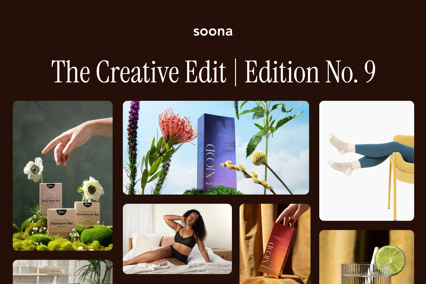
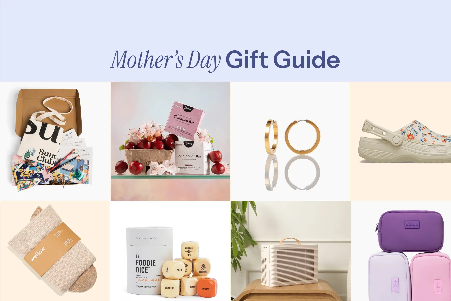
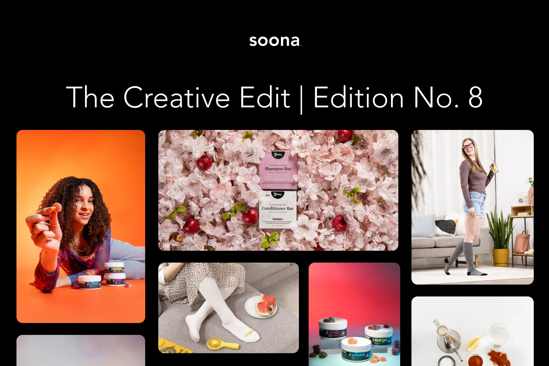
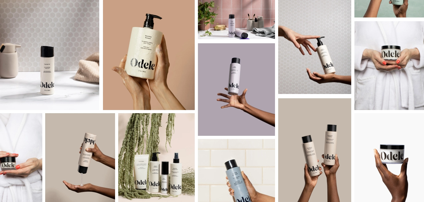
What’s the best way to make a strong first impression on your customers? Your product photography.
With ecommerce becoming a preferred way to shop, buyers want to understand the look and feel they would get from physically entering a store. This is why professional product photography services play such a crucial role in your shoppers’ buying process. The more angles, information, and even textures you can show of your product, the better.
Not only are your product photos essential for your website, but also for paid channels like Google ads, Facebook ads, and other platforms like YouTube and TikTok.
But how do you know which color background is best? You need to strike a balance between creativity and utility. This post will guide you through choosing the best background color for product photos.
Plain white backgrounds
Probably the most common background color for product shots is white. You can set your product photography up for success by starting on a white background. This is where we recommend all our clients start. A clean white backdrop can let a customer see your product without any visual distractions. Think of white backdrops as air. It helps you create a minimalist presentation that puts your product front and center. White backdrops really shine by letting your product shine.

A clean white background gives you versatility. They work well no matter what color your products are. (Yes, even if the product itself is white.) White subjects against a white background can work with the right lighting and editing to draw the eye to the product. You can create contrast, make a product pop, or even play with interesting shadows to bring in dimension.
It’s also worth noting that lots of image colors can create larger file sizes. If you're worried about load times on your website, plain white backgrounds may help decrease the overall data size of your product images.
White backgrounds are the most commonly used in ecommerce photography. It’s the safe, practical choice for most situations. Not to mention that a lot of online marketplaces require at least one product photo with a white background, like Amazon or Shopify, for example. Check out these white background product photography tips to ensure your images meet marketplace standards.
Neutrals
A neutral color like off white, gray, and beige provides a balanced backdrop that doesn’t overshadow the product. An off white or gray background can add a touch of sophistication but might not be as attention-grabbing as white or colored backgrounds. Neutral colors are best for fashion items, home decor, and lifestyle products.
Black backgrounds
When thinking about what kind of background to pair with your product, mood is another important thing to consider. While a white background can present a light, transparent feel to your marketing, a black background can add a touch of mystery or dramatic effect.

You might think black backgrounds aren’t ideal for black or darker products, but this isn’t necessarily the case. With certain lighting techniques, black backgrounds can actually offer surprising depth and intrigue to your images.
Color backgrounds
Depending on your branding, you may prefer more color to bring your product to life. If you think you might go for a color, consider the feeling certain colors evoke:
- Blue is often associated with trust, reliability, and suggests peacefulness.
- Green is associated with nature, health, or wealth.
- Yellow recalls happiness and sunshine.
You might also want to think about the overall color palette of your online store. Consider what would best complement the colors of your products and branding. When it comes to creative choices, there are no “right” or “wrong” answers, of course. But when considering your options, you can follow certain design principles to help guide your choices.
For example, you can pair colors that directly oppose each other on the color wheel, known as “complementary colors.” These maximize contrast and can make for great accents if your branding or website happens to be more neutral toned. You can also pair colors that are adjacent to each other on the color wheel, known as “analogous colors.” If your branding happens to have an analogous palette, choosing a complementary color for the background would offer the most contrast.
Now that you’ve just gotten a crash course on color theory, you can use color strategically to really grab customer attention. This is especially useful on social media feeds where your product is competing to draw attention from other highly engaging content.
Here are some product photography background ideas that incorporate color:
Bright and bold
Bright and bold colors are fun and eye-catching, creating a lively and energetic vibe. However, they can distract from the product if not chosen carefully, requiring a good understanding of color theory. Bright and bold backgrounds are great for youth-oriented products, seasonal items, and anything meant to evoke excitement.
Pastels
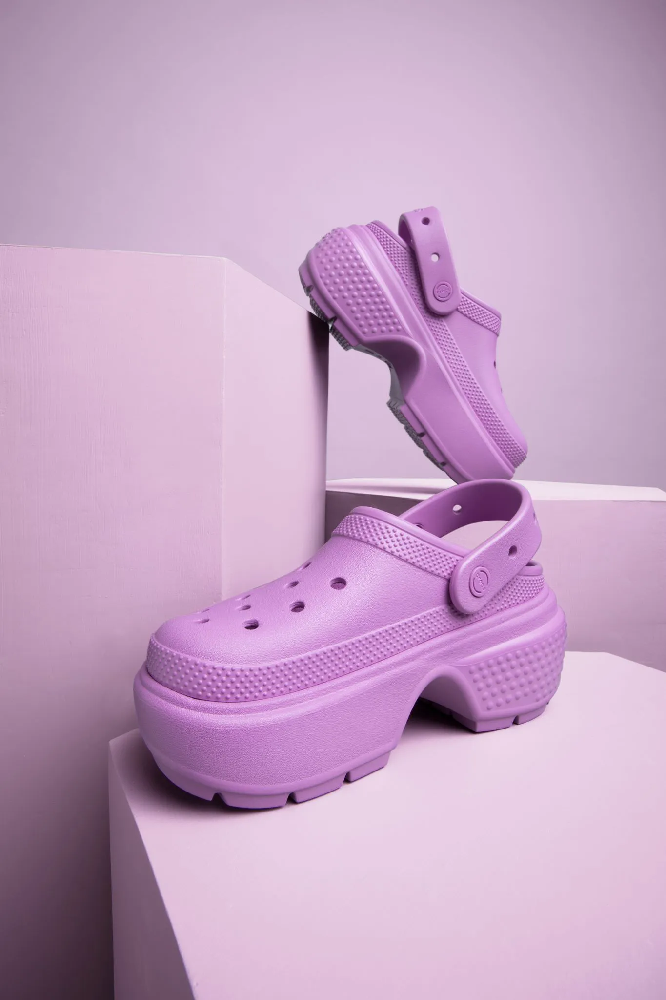
Pastel colors are soft and pleasing to the eye, creating a calm and inviting atmosphere. But they may not stand out as much in crowded listings. Pastels are perfect for baby products, beauty items, and spring/summer collections.
Solid colors
Solid color backgrounds are straightforward and effective, providing a clean and uniform look that keeps the focus on the product. They can range from bold primary colors to softer shades, depending on the desired effect.

Solid backgrounds are versatile and can be used to match or complement the product’s colors, enhancing the overall visual appeal.

Two-toned backgrounds
Two-toned backgrounds can add depth and interest to your product photos. By combining two colors, you can create a more dynamic and visually appealing image.

This technique can be particularly effective for products that need to stand out in a crowded market. Consider using complementary or analogous colors to create harmony and contrast in your images. You can even change the background color when you edit, optimizing for different aesthetics or seasonality. Go for red and green during the holidays, for example, and then change it to yellow and pink for summer.
Gradient backgrounds
A gradient background in product photography is a background that features a gradual transition between two or more colors. This transition can be smooth and subtle, blending from one color to another, or it can be more pronounced with distinct shifts in hue or shade.

Gradients can move in various directions—vertically, horizontally, diagonally, or even radially from a central point. They can help guide the viewer's eye toward the product and create a more engaging visual experience. You can create gradient backgrounds physically during the photoshoot using colored backdrops and lighting techniques or digitally in the post-production step.
Other considerations when choosing a background color
Background color is just one of the many things you can play with to express your brand’s vibe. The material, texture, and size of your backdrop can all play their part in a great product photo. Here's a closer look at how they work together:
Backdrop sizes
If you're doing all your own product photography, you’ll likely want to invest in a good backdrop. The dimensions of your backdrop could be as small as 23 x 35 in for flat lay photos (laying your product on a flat surface and shooting from overhead).
One advantage of smaller backdrops is portability. It's much easier to store and transport 23 x 35 in vinyl mats than 8 x 36 foot rolls of paper.
Alternatively, your backdrop could be as large as a 8-foot-wide roll of seamless paper serving as the background at your home studio.
Paper
When choosing a paper backdrop, we recommend it be seamless and non-reflective. This helps you get cleaner photos and could save you the trouble of extra editing later on.
Keep in mind that paper tends to get dirty with use, and since it’s not washable, any dirty areas may need to be trimmed off. Thankfully, paper is relatively cheap and you know what they say: clean paper, clean photo. Ok, that may not be something you say - but we do because we’re product photography nerds 😆
Muslin and cotton
Both of these materials are used in various proportions for certain types of backdrops. They’re more durable than plain paper, and they can even lend some texture, unless you’re deliberately ironing it out to eliminate any background details. Like paper, muslin and cotton also offer the advantage of being super portable.
Texture
Just as color dictates mood, texture also contributes to the look and feel of your images.

Wood is naturalistic and rustic, while marble may recall refinement and elegance. Other textures like fluff or glitter evoke youthful frivolity and fun.
We typically recommend bringing in faux surfaces with texture to create lifestyle scenes. Need a bathroom scene? Add some tile and marble. Kitchen table? Bring in the farmhouse wood boards.
Just remember that textures are made to amplify and compliment, not to draw the eye away from the main event—your product 🤩!
Lighting
So much of photography is about light and how it can be manipulated to create the image you want. Light can be dialed up or down to create the desired level of shadow. For example, evenly distributed light will make for softer shadows. This approach showcases the product without the visual distraction of harsher shadows. A soft shadow can also help emphasize the shape and detail of your product, especially against white.
By contrast, a hard shadow is darker and more defined. You might prefer this approach if you want your product to stand out more against the background or to add boldness and dimensionality to your images.
Angles
You may know your best selfie angle - but do you know your product’s best angle 🧐? You’ll want to set up your shots in a way that best shows off the packaging and prominently displays your product label. Generally speaking, product photographers mostly use three angles: straight on, 3/4ths, and overhead. Ensure that your photo shoot allows for enough time to capture the product from several perspectives so you have different angles to choose from.
Editing
Even after you capture the perfect photos, some editing will be needed before those images are ready to upload to your online store. You’ll want to make sure that certain elements like highlights and colors appear consistent across all your photos so that they really shine!
Brightness, contrast, and shadows may also need editing, and you might need additional retouching to correct odd reflections, blemishes, or other unintended visual distractions. It may seem like we’re getting in the weeds here, but these small post-production adjustments can often mean the difference between a dull product image and a beautiful one.
Generally, there are two types of editing to consider. The standard edit cures an image in the exact environment it was shot in. For example, if the product was shot on a white background, the standard edit will retain the tones from the actual background itself, whether it’s backdrop paper or a painted wall.
Alternatively, a pure white edit will remove all those tones and make the background perfectly white. you might decide that this is a better look for your online store, especially if the background of your website is also pale. A pure white background on your product photos may better meet a lot of online retailers’ image spec requirements.
{{product-catalogue}}
soona for the win
Given the very nuanced and technical nature of product photography, it’s no surprise that many online entrepreneurs struggle with it, especially those who are just starting out. That's where soona comes in. We’re experts in all things product photography.
Our goal is to showcase your products in the best light so they can dazzle and amaze your audience. We simplify everything by doing all the work for you. Our team of professionals will produce studio quality photos for your products, edited and ready to upload to all your ecommerce channels. All you have to do is choose your background, along with any other customizations you need, and we’ll take it from there. When you’re ready, book your shoot online and we’ll handle the rest.
{{studio-ad}}
Product photo background color FAQs
What is the best background color for products?
The best background color for products largely depends on the product type, brand identity, and the message you want to convey. White backgrounds are a popular choice because they are clean, simple, and versatile, allowing the product to be the focal point without any distractions. They are suitable for almost any product and provide a consistent, professional look, making them a safe and practical choice for ecommerce photography.
What color background is best for selling?
When it comes to selling, many websites stick to white. They’re widely used on platforms like Amazon and Shopify, which require at least one product image with a white background. White backgrounds highlight the product without any visual distractions, ensuring that the focus remains on the product itself. This can help in making the product look more appealing and professional, which is crucial for attracting customers and driving sales.
What’s the best way to make a strong first impression on your customers? Your product photography.
With ecommerce becoming a preferred way to shop, buyers want to understand the look and feel they would get from physically entering a store. This is why professional product photography services play such a crucial role in your shoppers’ buying process. The more angles, information, and even textures you can show of your product, the better.
Not only are your product photos essential for your website, but also for paid channels like Google ads, Facebook ads, and other platforms like YouTube and TikTok.
But how do you know which color background is best? You need to strike a balance between creativity and utility. This post will guide you through choosing the best background color for product photos.
Plain white backgrounds
Probably the most common background color for product shots is white. You can set your product photography up for success by starting on a white background. This is where we recommend all our clients start. A clean white backdrop can let a customer see your product without any visual distractions. Think of white backdrops as air. It helps you create a minimalist presentation that puts your product front and center. White backdrops really shine by letting your product shine.

A clean white background gives you versatility. They work well no matter what color your products are. (Yes, even if the product itself is white.) White subjects against a white background can work with the right lighting and editing to draw the eye to the product. You can create contrast, make a product pop, or even play with interesting shadows to bring in dimension.
It’s also worth noting that lots of image colors can create larger file sizes. If you're worried about load times on your website, plain white backgrounds may help decrease the overall data size of your product images.
White backgrounds are the most commonly used in ecommerce photography. It’s the safe, practical choice for most situations. Not to mention that a lot of online marketplaces require at least one product photo with a white background, like Amazon or Shopify, for example. Check out these white background product photography tips to ensure your images meet marketplace standards.
Neutrals
A neutral color like off white, gray, and beige provides a balanced backdrop that doesn’t overshadow the product. An off white or gray background can add a touch of sophistication but might not be as attention-grabbing as white or colored backgrounds. Neutral colors are best for fashion items, home decor, and lifestyle products.
Black backgrounds
When thinking about what kind of background to pair with your product, mood is another important thing to consider. While a white background can present a light, transparent feel to your marketing, a black background can add a touch of mystery or dramatic effect.

You might think black backgrounds aren’t ideal for black or darker products, but this isn’t necessarily the case. With certain lighting techniques, black backgrounds can actually offer surprising depth and intrigue to your images.
Color backgrounds
Depending on your branding, you may prefer more color to bring your product to life. If you think you might go for a color, consider the feeling certain colors evoke:
- Blue is often associated with trust, reliability, and suggests peacefulness.
- Green is associated with nature, health, or wealth.
- Yellow recalls happiness and sunshine.
You might also want to think about the overall color palette of your online store. Consider what would best complement the colors of your products and branding. When it comes to creative choices, there are no “right” or “wrong” answers, of course. But when considering your options, you can follow certain design principles to help guide your choices.
For example, you can pair colors that directly oppose each other on the color wheel, known as “complementary colors.” These maximize contrast and can make for great accents if your branding or website happens to be more neutral toned. You can also pair colors that are adjacent to each other on the color wheel, known as “analogous colors.” If your branding happens to have an analogous palette, choosing a complementary color for the background would offer the most contrast.
Now that you’ve just gotten a crash course on color theory, you can use color strategically to really grab customer attention. This is especially useful on social media feeds where your product is competing to draw attention from other highly engaging content.
Here are some product photography background ideas that incorporate color:
Bright and bold
Bright and bold colors are fun and eye-catching, creating a lively and energetic vibe. However, they can distract from the product if not chosen carefully, requiring a good understanding of color theory. Bright and bold backgrounds are great for youth-oriented products, seasonal items, and anything meant to evoke excitement.
Pastels
Pastel colors are soft and pleasing to the eye, creating a calm and inviting atmosphere. But they may not stand out as much in crowded listings. Pastels are perfect for baby products, beauty items, and spring/summer collections.
Solid colors
Solid color backgrounds are straightforward and effective, providing a clean and uniform look that keeps the focus on the product. They can range from bold primary colors to softer shades, depending on the desired effect.

Solid backgrounds are versatile and can be used to match or complement the product’s colors, enhancing the overall visual appeal.

Two-toned backgrounds
Two-toned backgrounds can add depth and interest to your product photos. By combining two colors, you can create a more dynamic and visually appealing image.

This technique can be particularly effective for products that need to stand out in a crowded market. Consider using complementary or analogous colors to create harmony and contrast in your images. You can even change the background color when you edit, optimizing for different aesthetics or seasonality. Go for red and green during the holidays, for example, and then change it to yellow and pink for summer.
Gradient backgrounds
A gradient background in product photography is a background that features a gradual transition between two or more colors. This transition can be smooth and subtle, blending from one color to another, or it can be more pronounced with distinct shifts in hue or shade.

Gradients can move in various directions—vertically, horizontally, diagonally, or even radially from a central point. They can help guide the viewer's eye toward the product and create a more engaging visual experience. You can create gradient backgrounds physically during the photoshoot using colored backdrops and lighting techniques or digitally in the post-production step.
Other considerations when choosing a background color
Background color is just one of the many things you can play with to express your brand’s vibe. The material, texture, and size of your backdrop can all play their part in a great product photo. Here's a closer look at how they work together:
Backdrop sizes
If you're doing all your own product photography, you’ll likely want to invest in a good backdrop. The dimensions of your backdrop could be as small as 23 x 35 in for flat lay photos (laying your product on a flat surface and shooting from overhead).
One advantage of smaller backdrops is portability. It's much easier to store and transport 23 x 35 in vinyl mats than 8 x 36 foot rolls of paper.
Alternatively, your backdrop could be as large as a 8-foot-wide roll of seamless paper serving as the background at your home studio.
Paper
When choosing a paper backdrop, we recommend it be seamless and non-reflective. This helps you get cleaner photos and could save you the trouble of extra editing later on.
Keep in mind that paper tends to get dirty with use, and since it’s not washable, any dirty areas may need to be trimmed off. Thankfully, paper is relatively cheap and you know what they say: clean paper, clean photo. Ok, that may not be something you say - but we do because we’re product photography nerds 😆
Muslin and cotton
Both of these materials are used in various proportions for certain types of backdrops. They’re more durable than plain paper, and they can even lend some texture, unless you’re deliberately ironing it out to eliminate any background details. Like paper, muslin and cotton also offer the advantage of being super portable.
Texture
Just as color dictates mood, texture also contributes to the look and feel of your images.

Wood is naturalistic and rustic, while marble may recall refinement and elegance. Other textures like fluff or glitter evoke youthful frivolity and fun.
We typically recommend bringing in faux surfaces with texture to create lifestyle scenes. Need a bathroom scene? Add some tile and marble. Kitchen table? Bring in the farmhouse wood boards.
Just remember that textures are made to amplify and compliment, not to draw the eye away from the main event—your product 🤩!
Lighting
So much of photography is about light and how it can be manipulated to create the image you want. Light can be dialed up or down to create the desired level of shadow. For example, evenly distributed light will make for softer shadows. This approach showcases the product without the visual distraction of harsher shadows. A soft shadow can also help emphasize the shape and detail of your product, especially against white.
By contrast, a hard shadow is darker and more defined. You might prefer this approach if you want your product to stand out more against the background or to add boldness and dimensionality to your images.
Angles
You may know your best selfie angle - but do you know your product’s best angle 🧐? You’ll want to set up your shots in a way that best shows off the packaging and prominently displays your product label. Generally speaking, product photographers mostly use three angles: straight on, 3/4ths, and overhead. Ensure that your photo shoot allows for enough time to capture the product from several perspectives so you have different angles to choose from.
Editing
Even after you capture the perfect photos, some editing will be needed before those images are ready to upload to your online store. You’ll want to make sure that certain elements like highlights and colors appear consistent across all your photos so that they really shine!
Brightness, contrast, and shadows may also need editing, and you might need additional retouching to correct odd reflections, blemishes, or other unintended visual distractions. It may seem like we’re getting in the weeds here, but these small post-production adjustments can often mean the difference between a dull product image and a beautiful one.
Generally, there are two types of editing to consider. The standard edit cures an image in the exact environment it was shot in. For example, if the product was shot on a white background, the standard edit will retain the tones from the actual background itself, whether it’s backdrop paper or a painted wall.
Alternatively, a pure white edit will remove all those tones and make the background perfectly white. you might decide that this is a better look for your online store, especially if the background of your website is also pale. A pure white background on your product photos may better meet a lot of online retailers’ image spec requirements.
{{product-catalogue}}
soona for the win
Given the very nuanced and technical nature of product photography, it’s no surprise that many online entrepreneurs struggle with it, especially those who are just starting out. That's where soona comes in. We’re experts in all things product photography.
Our goal is to showcase your products in the best light so they can dazzle and amaze your audience. We simplify everything by doing all the work for you. Our team of professionals will produce studio quality photos for your products, edited and ready to upload to all your ecommerce channels. All you have to do is choose your background, along with any other customizations you need, and we’ll take it from there. When you’re ready, book your shoot online and we’ll handle the rest.
{{studio-ad}}
Product photo background color FAQs
What is the best background color for products?
The best background color for products largely depends on the product type, brand identity, and the message you want to convey. White backgrounds are a popular choice because they are clean, simple, and versatile, allowing the product to be the focal point without any distractions. They are suitable for almost any product and provide a consistent, professional look, making them a safe and practical choice for ecommerce photography.
What color background is best for selling?
When it comes to selling, many websites stick to white. They’re widely used on platforms like Amazon and Shopify, which require at least one product image with a white background. White backgrounds highlight the product without any visual distractions, ensuring that the focus remains on the product itself. This can help in making the product look more appealing and professional, which is crucial for attracting customers and driving sales.


