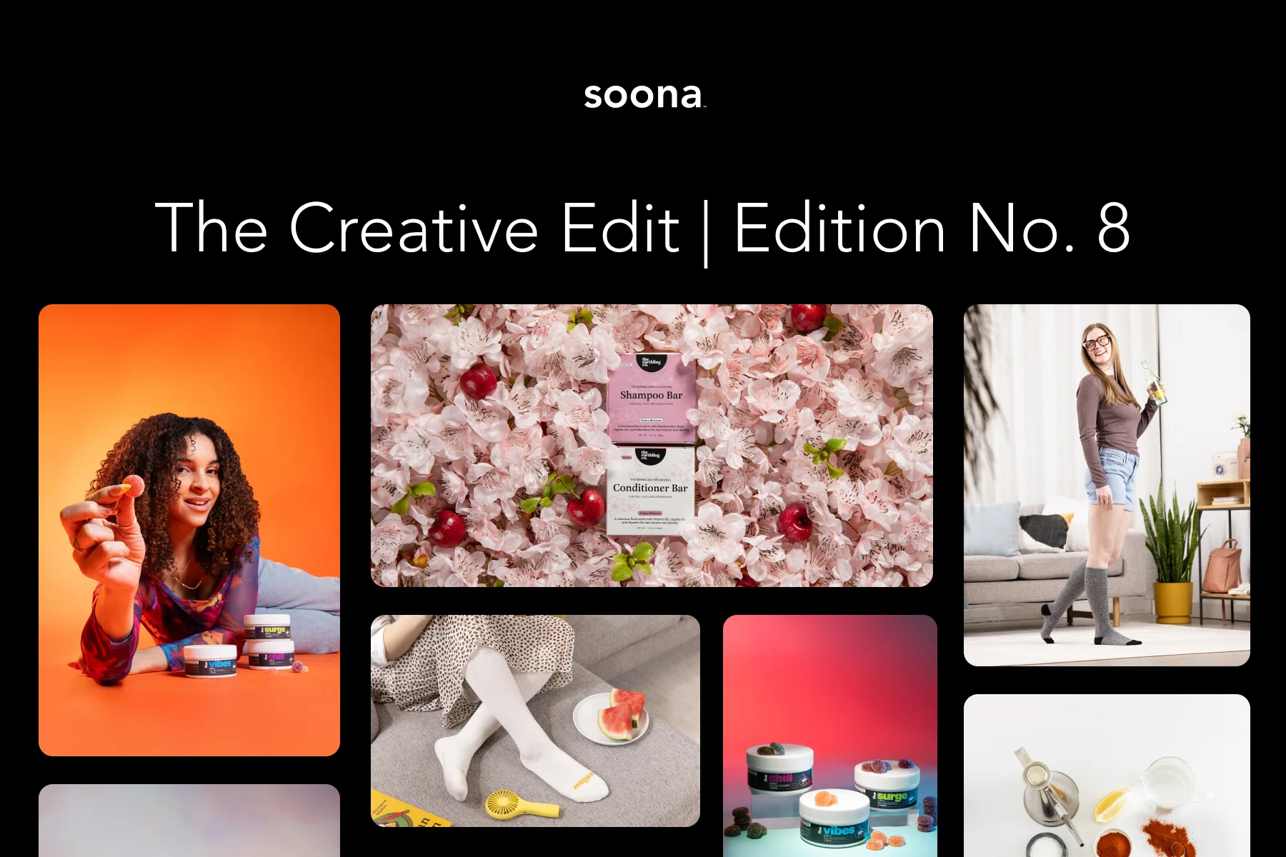


Using Color Theory to Create Eye-Catching Fashion Product Photos
It’s no secret that colors play a huge role in fashion, and color theory is the mastermind behind it all. No matter where you look, you’ll see colors mixed and matched to create eye-catching designs and bold trends.
To give your brand the best chance at attracting customers, show-stopping fashion product photos are a must. Not sure how to bring the color wheel to life in your photos? No stress. At soona, we have more than a few tricks up our sleeve to get you up to speed with color theory before you can say “complementary.”
We’ve put together some tips to help you elevate your next photo shoot with the power of color theory. But first, let’s dive into color theory, why it matters, and how you can use it wisely.
What is color theory?
Before we knew what the color wheel was, we knew Crayola. There was nothing quite like the feeling of opening a brand-new box of 64 colors. You felt like you could do anything. Understanding color theory gives photographers that same feeling.
So, what exactly is color theory?
Color theory is an understanding of how the color wheel works. It’s the idea behind the color wheel and how all the colors work together to get the viewer to feel something. Viewing color in this way started way back in 1666 when Sir Issac Newton developed the color wheel. By doing so, he changed the way we viewed color forever.
The color wheel is comprised of 12 colors split up into three groups: primary, secondary, and tertiary colors.
- Primary colors are red, blue, and yellow. These can’t be mixed or created by combining other colors. They form the base of the color wheel and are the foundation for all other shades.
- Secondary colors are created when two primary colors are mixed together in equal amounts. These colors include green, orange, and purple and sit around the center of the color wheel.
- Tertiary colors are created when primary and secondary colors are mixed together. These colors, such as yellow-orange, red-orange, and blue-green, bridge the gap between the two colors and form a complete circle.
In color theory, neutral colors such as black, gray, and white aren't represented as shades in the wheel but as an off-center point. These colors often act as the backdrop for the other colors in composition, allowing them to stand out and emphasize certain aspects of the image.

Show-Stopping Color Schemes to Use
To get the most benefit from color theory, you’ll need to bring yourself up to speed with the various color schemes. These schemes set the foundation for creating impactful visuals for your fashion brand. Use these color groups to form relationships between colors that make up the color wheel.
{{studio-ad}}
Complimentary Colors
Complimentary colors lie opposite one another on the color wheel. This distance means that when paired together, they create eye-popping visuals that produce electrifying looks.
Colors: Yellow and purple, red and green, blue and orange

Triadic Colors
As the name suggests, triadic colors are colors that form an equilateral triangle on the color wheel chart. These colors all lie an equal distance from each other, bringing a unique balance to their color combinations.
Colors: Yellow, red, and blue or orange, purple, and green
Tonal colors
Tonal colors are yet another way to create a pleasing aesthetic within your product photos. These colors are shades of the same hue. These are color combos that include two different but very close hues like rose pink and scarlet red, which offer a soft and subtle visual without being overly jarring.
Colors: Blue = soft sky blue, dark navy blue, tiffany blue, royal blue

Analogous Colors
Analogous color schemes are particularly effective in product photography. This involves using colors that are next to each other on the color spectrum. This type of color scheme can be used to create a sense of cohesion and unity, as well as to draw attention to particular elements in the image. They create a subtle and harmonious effect that calms and relaxes the viewer when used together.
Colors: Pink and red, blue and green

Monochromatic Colors
The monochromatic color scheme uses the same shade of color in an outfit from head to toe. We’re talking shirts, pants, shoes, bags —everything. (Ever hear of all-black everything?) Many people choose to add texture and patterns in the same shade to spice up their monochromatic looks.
Why is color theory important?
While it’s great to use color theory for the “wow” factor, don’t just stop there. Instead, think about the story you want to tell with your photos. Understanding color theory and using it to your advantage can highlight the product's key features and evoke the right emotions from your viewers. Emotions like “I needed that jacket in my closet yesterday.” Those kinds of emotions.
Meaning of Colors
If a picture is worth a thousand words, the colors that make up the photo are worth hundreds. The colors you choose tell the consumer what kind of business you are and what message you’re trying to convey. Check out some popular colors on the color wheel chart and their meanings below:
Warm Colors
- Red: Generally associated with passion, love, power, and strength. Used to evoke strong emotions like aggression and dominance.
- Orange: Stirs up feelings of happiness, warmth, sunshine, and fun. This color is used to evoke feelings of wellness and vibrancy in brands.
- Yellow: Yellow is viewed as an optimistic and confident color. It’s often associated with sunshine, hope, and cheerfulness.
- Pink: This romantic color evokes feelings of femininity, love, kindness, and relaxation.
Cool Colors
- Blue: A calming color that conveys stability, seriousness, professionalism and tranquility.
- Green: This bright color is used to bring out feelings of health, nature, and vitality for product photography.
- Purple: The color purple evokes the feeling of luxury or royalty, often used to display opulence.
Neutral Colors
- Black: The darkest of all colors, black conveys feelings of mystery, power and elegance.
- White: The opposite of black, white is associated with purity, brilliance, innocence, and cleanliness.
- Grey: A middle ground between black and white, grey is used to bring out feelings of a formal or sophisticated appearance but can sometimes be emotionless as well.
How do you relate color theory to fashion and clothing product photography?
And now, the question you’ve all been waiting for. How can I connect color theory to product photography? We thought you’d never ask.
Ever heard of color psychology?
Statistics show that over 90% of impressions are influenced by colors alone and that colors can increase a brand's awareness by a whopping 80%. Colors bring out emotional reactions and affect how we view the world around us. People may have certain reactions to colors based on prior experiences or even the culture they live in. For some people, jarring colors in an outfit may turn them away, while dull colors could mean that your product may get passed over for something more exciting.
Pairing colors together is almost like walking a tightrope. Lean too far to one side, and you risk losing customers. Choosing colors that represent your brand while showcasing your products will help you work alongside your marketing efforts, resulting in products that sell.
Why not utilize analogous colors to create depth and dimension? Or how about using a single pop of an accent color to create a classic and conservative look? Better yet, why not create a monochromatic look with shades of one hue to make it appear more “expensive”? The possibilities are endless.
Color theory plays a huge role in your branding and marketing. The types of backgrounds you choose and how you mix and match outfits will significantly impact your product photography.
Create the right look by matching outfits
Matching outfits is arguably the most important part of showcasing your clothing products. Many people use the looks in online stores to determine how they will style the item themselves. If you’re shooting a skirt for summer, picking a heavy, dark-colored sweater won’t do much to show the potential of the skirt. Instead, you’ll be better off choosing a light-colored top in a warm color to show off the potential of the skirt.
On the other hand, let’s say you’re photographing a light blue men’s necktie. Use the tonal color scheme and place it over a darker shade of blue to bring out the subtleties of the tie, while letting it be the star of the show. In this way, you draw attention to the item without distracting viewers with contrasting colors.

Choose Backgrounds Wisely
When it comes to product photography, it’s not enough to simply have a killer product. The overall visual presentation is what will move shoppers to add items to their carts. The backgrounds you pick will set the tone for the message you want to communicate to the customers who visit your site. Choosing backgrounds wisely can help set you apart from other stores and craft your brand identity.
Black backgrounds
The color black is often associated with professionalism, elegance, and formal occasions, like your standard black tie events. As a result, it’s generally chosen as a background to showcase products like luxury jewelry, cosmetics, or electronics. Since black has the darkest shades among colors, it's the perfect background to attract attention to the smallest details of your product. Black also implies that your product is full of mystery and style, which work to pull in the viewer.
Depending on how you choose to style your product, a black background can create shadows and reflections that result in a striking image.
Bold Solid color backgrounds
Solid colors are almost always a great choice for fashion photography backgrounds. Think of some of your favorite clothing brands. Chances are, they choose to display their items with solid color backgrounds to make the products pop. Solid colors breathe life into items, and using a background with two tones can add a bit of playfulness to your brand.
For example, warm colors such as red, orange, and yellow are often used to grab attention and create a sense of excitement and energy. Cool colors such as blue, green, and purple are calming and reassuring and can make a product appear more sophisticated.
Always test and make notes of what color combinations look best. This way, you can save these colors for future reference and easily replicate your best work.
White Backgrounds
Less is more rings true when it comes to white backgrounds. While a white background is inherently simple, it leaves room for the product to shine, as white can often bring out the best in every image. The simplicity of the color promotes uniformity and offers a fresh, clean look for your items.

Spice up Your Life With Some Color… and soona 😜
The ball is in your court now. You can take your clothing product photography to the next level with the right color combination. The next time you plan a product photography session, use the principles of color theory to create unique and eye-catching visuals.
Experiment with different shades within the same color family or go outside the box with an analogous look that draws shoppers in. With these tips, you’ll have a dynamic and captivating photoshoot in no time.
Visit soona.co and use your new-found color skills to spice up your product photos.
Using Color Theory to Create Eye-Catching Fashion Product Photos
It’s no secret that colors play a huge role in fashion, and color theory is the mastermind behind it all. No matter where you look, you’ll see colors mixed and matched to create eye-catching designs and bold trends.
To give your brand the best chance at attracting customers, show-stopping fashion product photos are a must. Not sure how to bring the color wheel to life in your photos? No stress. At soona, we have more than a few tricks up our sleeve to get you up to speed with color theory before you can say “complementary.”
We’ve put together some tips to help you elevate your next photo shoot with the power of color theory. But first, let’s dive into color theory, why it matters, and how you can use it wisely.
What is color theory?
Before we knew what the color wheel was, we knew Crayola. There was nothing quite like the feeling of opening a brand-new box of 64 colors. You felt like you could do anything. Understanding color theory gives photographers that same feeling.
So, what exactly is color theory?
Color theory is an understanding of how the color wheel works. It’s the idea behind the color wheel and how all the colors work together to get the viewer to feel something. Viewing color in this way started way back in 1666 when Sir Issac Newton developed the color wheel. By doing so, he changed the way we viewed color forever.
The color wheel is comprised of 12 colors split up into three groups: primary, secondary, and tertiary colors.
- Primary colors are red, blue, and yellow. These can’t be mixed or created by combining other colors. They form the base of the color wheel and are the foundation for all other shades.
- Secondary colors are created when two primary colors are mixed together in equal amounts. These colors include green, orange, and purple and sit around the center of the color wheel.
- Tertiary colors are created when primary and secondary colors are mixed together. These colors, such as yellow-orange, red-orange, and blue-green, bridge the gap between the two colors and form a complete circle.
In color theory, neutral colors such as black, gray, and white aren't represented as shades in the wheel but as an off-center point. These colors often act as the backdrop for the other colors in composition, allowing them to stand out and emphasize certain aspects of the image.
Show-Stopping Color Schemes to Use
To get the most benefit from color theory, you’ll need to bring yourself up to speed with the various color schemes. These schemes set the foundation for creating impactful visuals for your fashion brand. Use these color groups to form relationships between colors that make up the color wheel.
{{studio-ad}}
Complimentary Colors
Complimentary colors lie opposite one another on the color wheel. This distance means that when paired together, they create eye-popping visuals that produce electrifying looks.
Colors: Yellow and purple, red and green, blue and orange
Triadic Colors
As the name suggests, triadic colors are colors that form an equilateral triangle on the color wheel chart. These colors all lie an equal distance from each other, bringing a unique balance to their color combinations.
Colors: Yellow, red, and blue or orange, purple, and green
Tonal colors
Tonal colors are yet another way to create a pleasing aesthetic within your product photos. These colors are shades of the same hue. These are color combos that include two different but very close hues like rose pink and scarlet red, which offer a soft and subtle visual without being overly jarring.
Colors: Blue = soft sky blue, dark navy blue, tiffany blue, royal blue
Analogous Colors
Analogous color schemes are particularly effective in product photography. This involves using colors that are next to each other on the color spectrum. This type of color scheme can be used to create a sense of cohesion and unity, as well as to draw attention to particular elements in the image. They create a subtle and harmonious effect that calms and relaxes the viewer when used together.
Colors: Pink and red, blue and green
Monochromatic Colors
The monochromatic color scheme uses the same shade of color in an outfit from head to toe. We’re talking shirts, pants, shoes, bags —everything. (Ever hear of all-black everything?) Many people choose to add texture and patterns in the same shade to spice up their monochromatic looks.
Why is color theory important?
While it’s great to use color theory for the “wow” factor, don’t just stop there. Instead, think about the story you want to tell with your photos. Understanding color theory and using it to your advantage can highlight the product's key features and evoke the right emotions from your viewers. Emotions like “I needed that jacket in my closet yesterday.” Those kinds of emotions.
Meaning of Colors
If a picture is worth a thousand words, the colors that make up the photo are worth hundreds. The colors you choose tell the consumer what kind of business you are and what message you’re trying to convey. Check out some popular colors on the color wheel chart and their meanings below:
Warm Colors
- Red: Generally associated with passion, love, power, and strength. Used to evoke strong emotions like aggression and dominance.
- Orange: Stirs up feelings of happiness, warmth, sunshine, and fun. This color is used to evoke feelings of wellness and vibrancy in brands.
- Yellow: Yellow is viewed as an optimistic and confident color. It’s often associated with sunshine, hope, and cheerfulness.
- Pink: This romantic color evokes feelings of femininity, love, kindness, and relaxation.
Cool Colors
- Blue: A calming color that conveys stability, seriousness, professionalism and tranquility.
- Green: This bright color is used to bring out feelings of health, nature, and vitality for product photography.
- Purple: The color purple evokes the feeling of luxury or royalty, often used to display opulence.
Neutral Colors
- Black: The darkest of all colors, black conveys feelings of mystery, power and elegance.
- White: The opposite of black, white is associated with purity, brilliance, innocence, and cleanliness.
- Grey: A middle ground between black and white, grey is used to bring out feelings of a formal or sophisticated appearance but can sometimes be emotionless as well.
How do you relate color theory to fashion and clothing product photography?
And now, the question you’ve all been waiting for. How can I connect color theory to product photography? We thought you’d never ask.
Ever heard of color psychology?
Statistics show that over 90% of impressions are influenced by colors alone and that colors can increase a brand's awareness by a whopping 80%. Colors bring out emotional reactions and affect how we view the world around us. People may have certain reactions to colors based on prior experiences or even the culture they live in. For some people, jarring colors in an outfit may turn them away, while dull colors could mean that your product may get passed over for something more exciting.
Pairing colors together is almost like walking a tightrope. Lean too far to one side, and you risk losing customers. Choosing colors that represent your brand while showcasing your products will help you work alongside your marketing efforts, resulting in products that sell.
Why not utilize analogous colors to create depth and dimension? Or how about using a single pop of an accent color to create a classic and conservative look? Better yet, why not create a monochromatic look with shades of one hue to make it appear more “expensive”? The possibilities are endless.
Color theory plays a huge role in your branding and marketing. The types of backgrounds you choose and how you mix and match outfits will significantly impact your product photography.
Create the right look by matching outfits
Matching outfits is arguably the most important part of showcasing your clothing products. Many people use the looks in online stores to determine how they will style the item themselves. If you’re shooting a skirt for summer, picking a heavy, dark-colored sweater won’t do much to show the potential of the skirt. Instead, you’ll be better off choosing a light-colored top in a warm color to show off the potential of the skirt.
On the other hand, let’s say you’re photographing a light blue men’s necktie. Use the tonal color scheme and place it over a darker shade of blue to bring out the subtleties of the tie, while letting it be the star of the show. In this way, you draw attention to the item without distracting viewers with contrasting colors.
Choose Backgrounds Wisely
When it comes to product photography, it’s not enough to simply have a killer product. The overall visual presentation is what will move shoppers to add items to their carts. The backgrounds you pick will set the tone for the message you want to communicate to the customers who visit your site. Choosing backgrounds wisely can help set you apart from other stores and craft your brand identity.
Black backgrounds
The color black is often associated with professionalism, elegance, and formal occasions, like your standard black tie events. As a result, it’s generally chosen as a background to showcase products like luxury jewelry, cosmetics, or electronics. Since black has the darkest shades among colors, it's the perfect background to attract attention to the smallest details of your product. Black also implies that your product is full of mystery and style, which work to pull in the viewer.
Depending on how you choose to style your product, a black background can create shadows and reflections that result in a striking image.
Bold Solid color backgrounds
Solid colors are almost always a great choice for fashion photography backgrounds. Think of some of your favorite clothing brands. Chances are, they choose to display their items with solid color backgrounds to make the products pop. Solid colors breathe life into items, and using a background with two tones can add a bit of playfulness to your brand.
For example, warm colors such as red, orange, and yellow are often used to grab attention and create a sense of excitement and energy. Cool colors such as blue, green, and purple are calming and reassuring and can make a product appear more sophisticated.
Always test and make notes of what color combinations look best. This way, you can save these colors for future reference and easily replicate your best work.
White Backgrounds
Less is more rings true when it comes to white backgrounds. While a white background is inherently simple, it leaves room for the product to shine, as white can often bring out the best in every image. The simplicity of the color promotes uniformity and offers a fresh, clean look for your items.
Spice up Your Life With Some Color… and soona 😜
The ball is in your court now. You can take your clothing product photography to the next level with the right color combination. The next time you plan a product photography session, use the principles of color theory to create unique and eye-catching visuals.
Experiment with different shades within the same color family or go outside the box with an analogous look that draws shoppers in. With these tips, you’ll have a dynamic and captivating photoshoot in no time.
Visit soona.co and use your new-found color skills to spice up your product photos.