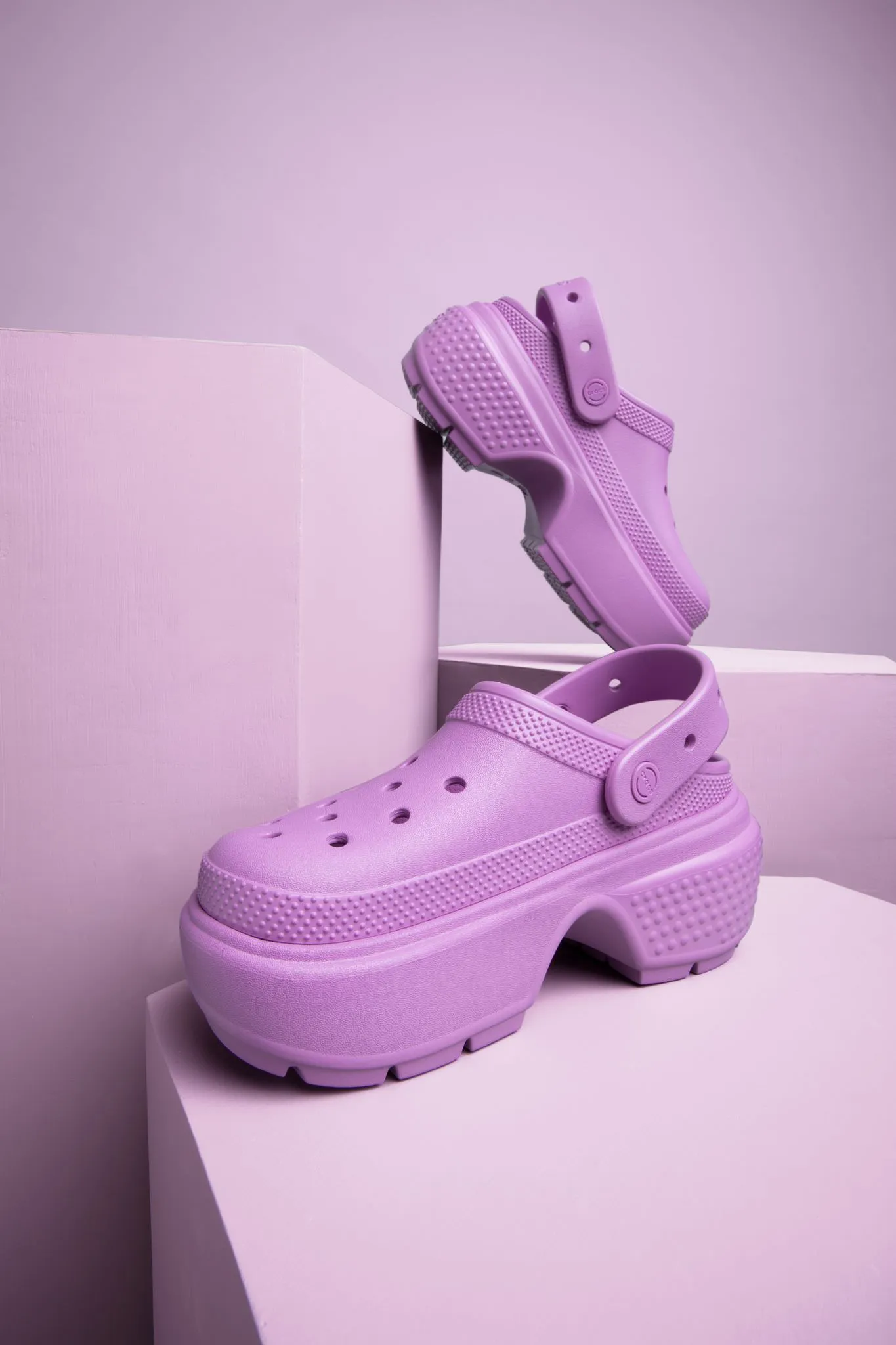
It’s important to always look for ways to optimize ecommerce product photos. One way to do that is by incorporating text overlays, a technique that involves placing text directly onto an image to provide additional context, information, or calls to action.
Text overlay has become increasingly popular—it can result in higher click-through rates (CTRs), better engagement, and improved sales.
However, it’s essential to carefully consider your approach when adding text overlays to your Amazon product images. There are certain guidelines and best practices to ensure your efforts are both effective and compliant with Amazon-specific requirements. In this post, let’s chat about how to use text overlay in your listings.
What is text overlay?
Text overlay is a design technique that involves placing text, or copy, on top of an image to create a compelling visual for various purposes, such as designing Amazon product listings or enhancing the user interface (UI).
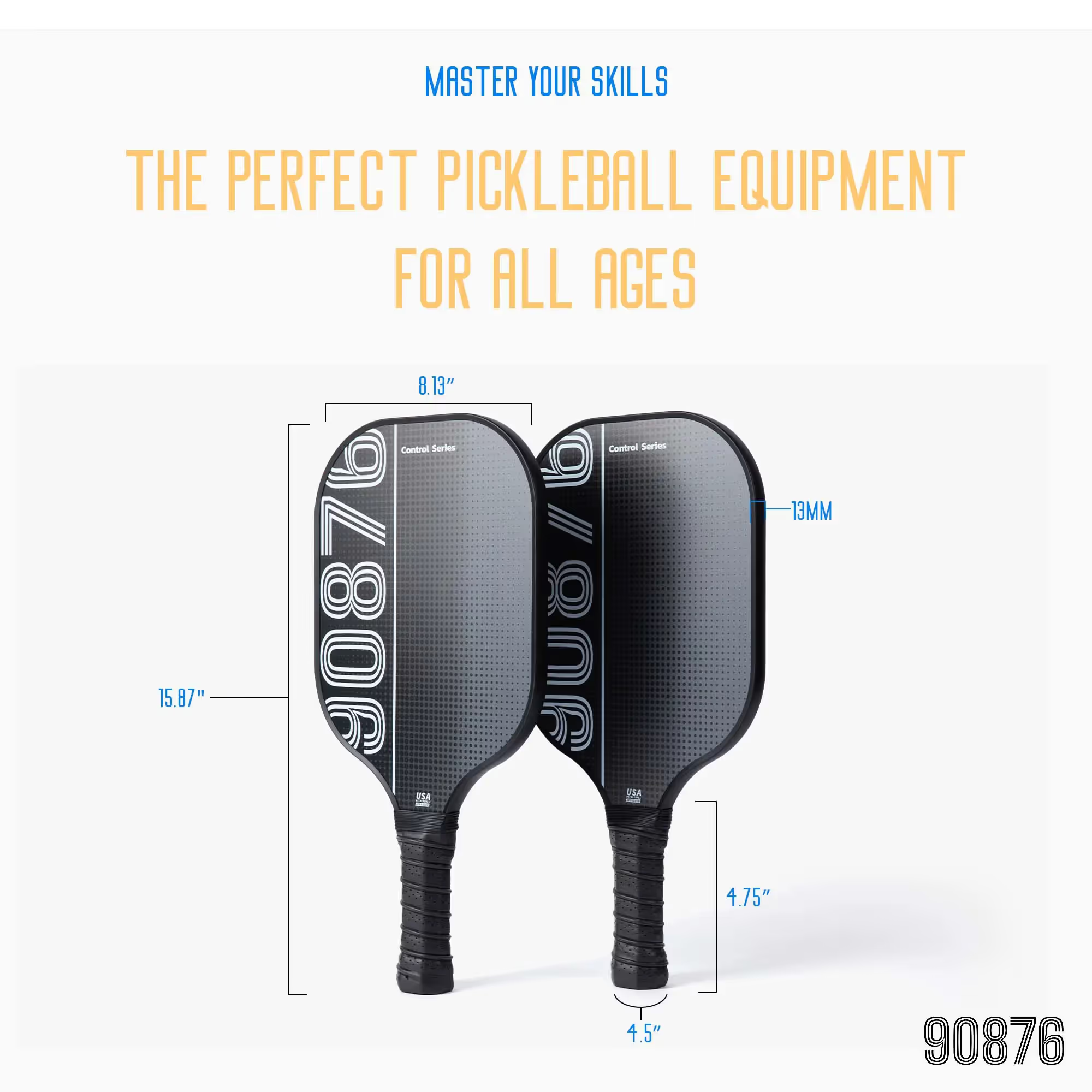
Text overlay is a powerful tool for enhancing Amazon product listings. It involves placing copy (words) directly on the product images to provide key information and emphasize specific features.
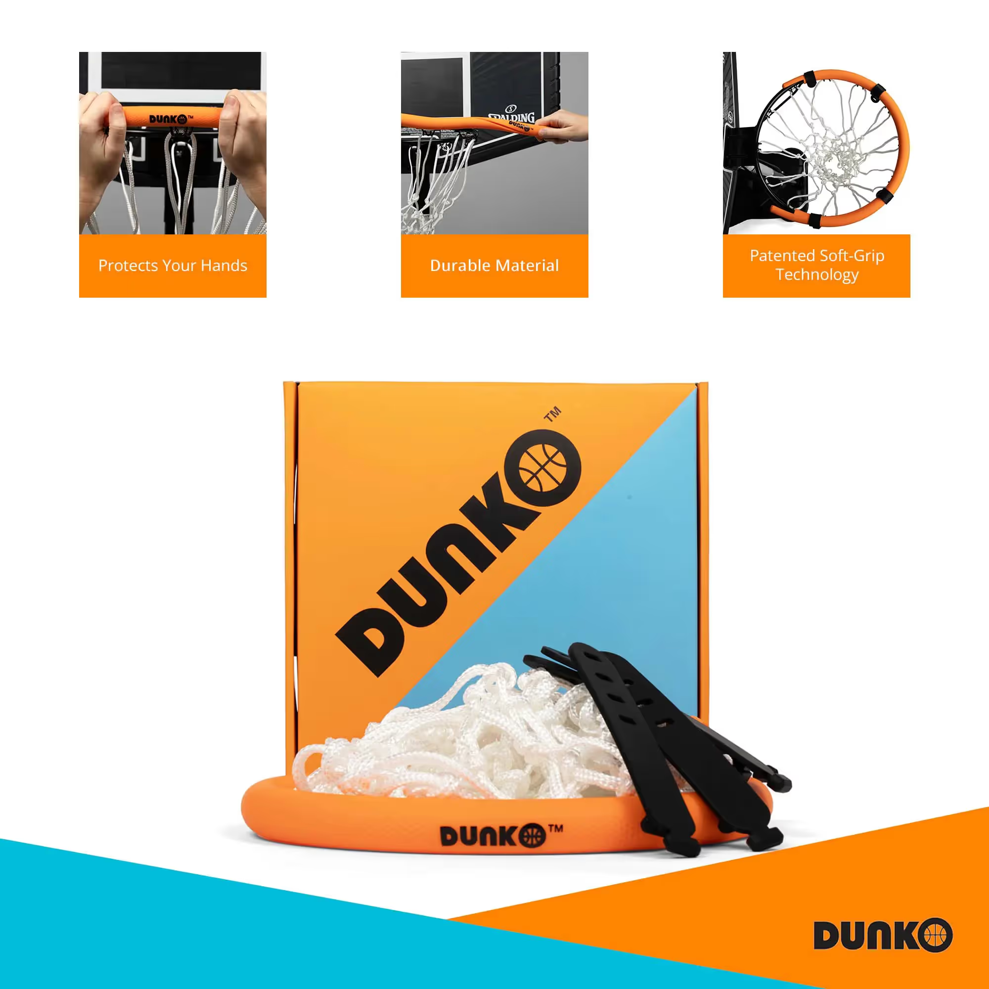
Check this out: How to create Amazon infographics >
Why use text overlay for product photos
Make your content accessible to all shoppers
Text overlay can improve accessibility for your product content, especially for people with visual impairments, conditions, or disabilities. This not only makes product listings more accessible but also provides a better shopping experience for all users, regardless of their visual ability.
{{amazon-ad}}
To ensure your text overlay is supporting accessibility, use legible fonts in a color that’s easy to see and read over the background. We’ll get more into these design considerations in a bit!
Overlay by itself isn’t enough, though. Also make sure you properly tag overlays for screen reader compatibility. This means providing accurate and descriptive image alt text to describe the content of the image, as well as any embedded text. Screen readers rely on alt text to convey information to visually impaired users, so don’t overlook this step when creating your overlays.
Accessibility in motion: Creating accessible videos: best practices for video accessibility >
Drive clicks and conversions
One of the major benefits of using text overlay is the ability to communicate essential product information at a glance. Text can catch customer attention, making them curious about the product.
Overlays also bring improved visual hierarchy to product images making it easier for shoppers to quickly get the most important information. Properly placing the text on the image ensures that isn’t intrusive, but rather complements the overall visual composition.
By adding a concise and visually appealing tagline or call-to-action (CTA), you can motivate potential customers to explore the product further and even make a purchase—especially helpful when selling products with a unique selling proposition or a limited-time offer.
{{studio-ad}}
Offset returns and negative reviews
Providing clear and accurate information about the product and its features allows customers to have a better understanding of their purchase, which can lead to higher satisfaction and fewer returns.
The return process isn’t only costly, but it also means you’ve missed out on a sale. Excessive negative reviews and returns can impact your visibility in the algorithm and Amazon performance metrics, potentially affecting account standings and access to specific selling features, such as the Buy Box.
Promote brand awareness
Text overlay helps you effectively communicate your brand message and express your visual brand identity. An image with a well-placed overlay can emphasize your product’s unique selling points, highlight special features, or offer promotional information.
You can use text overlay to reinforce your brand message, reinforcing a slogan or core values. Overlaying creative and informative text can uplift product images, making them more engaging and appealing to potential customers.
Bookmark this: Create stunning Amazon infographics: a step-by-step guide >
How to overlay text on image: 5 steps
Follow these five steps to add text to your photos:
Step 1: Choose an appropriate image
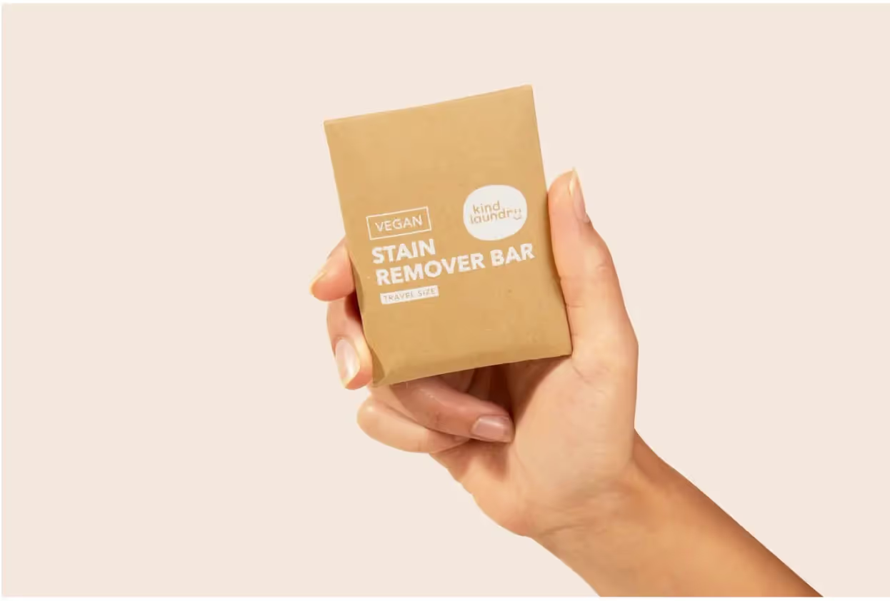
Select an image that represents your product well and has enough space to accommodate the overlay text. Make sure the background isn’t too busy and doesn’t visually clash with the copy, ensuring it remains legible.
For example, this image has lots of empty space on all sides, which provides a great canvas:
Step 2: Write your text
Always prioritize keeping the listing informative and visually appealing, with a focus on the product and its features. Start by identifying the essential information that needs to be communicated to the viewer. Then you can start writing! ✍️
Limit yourself to the essential info, keywords, or product features—overdoing it can overwhelm your audience. This also enables visually impaired users to process the information quickly and efficiently. Keep the words concise and straightforward, using short phrases instead of long sentences. You could even use bulleted lists.
You really don’t need to go overboard. This example only shows product dimensions in its text overlay:
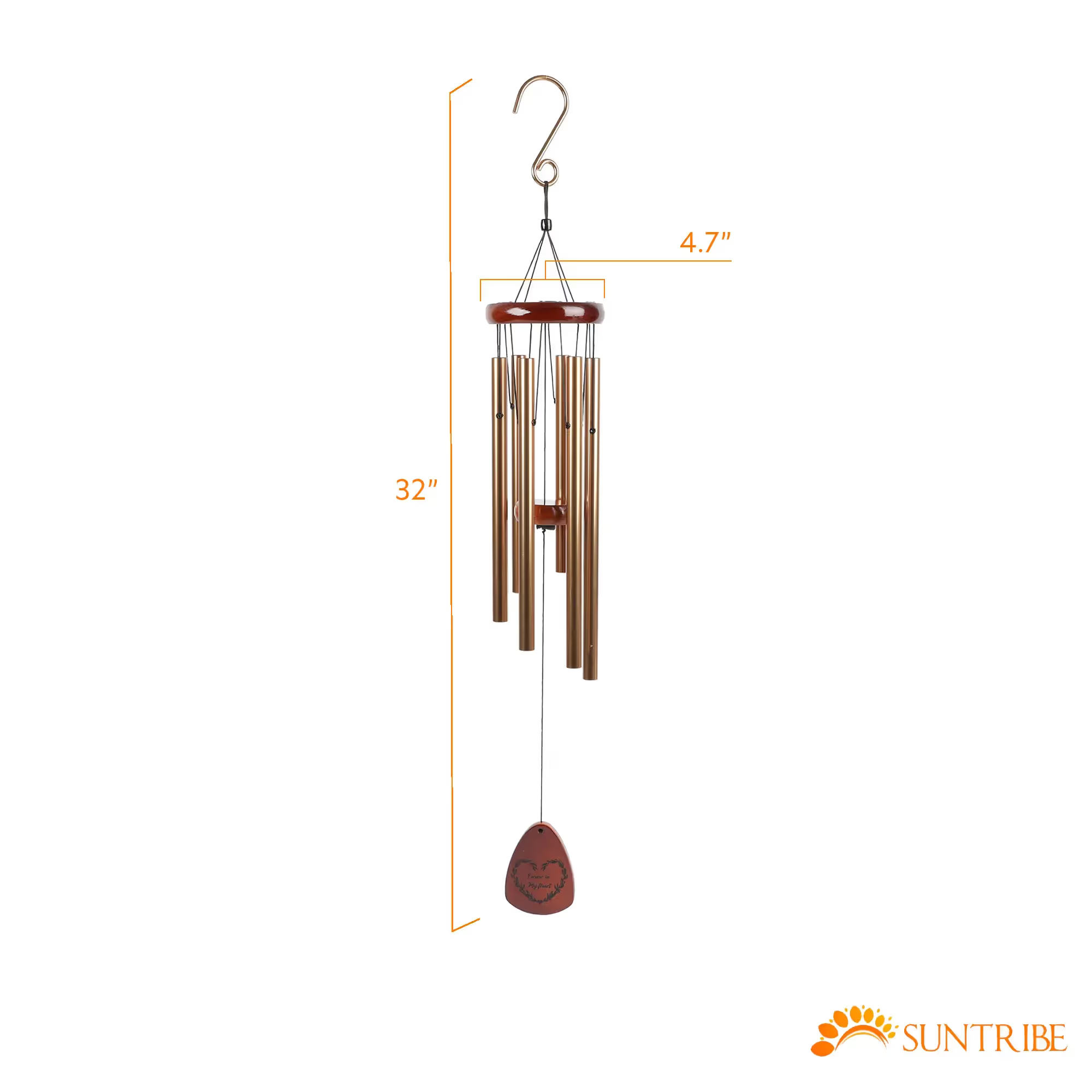
Highlight product features or benefits that differentiate your product from the competition. You can also highlight promotions and discounts—it’s an excellent way to call attention to time-sensitive promotions, product launches, or limited-time offers.
You might also include a strong CTA to guide shoppers towards taking the desired action, like adding the item to their shopping cart or exploring more product offerings. Use actionable phrases like “Buy Now!” or “Limited Stock Available!”
Step 3: Format your text overlay
Consider the following characteristics when formatting your text:
- Font
- Size
- Color
- Style
Font
When overlaying text on an image, choose a readable and aesthetically pleasing font. It should be clear and legible when placed on your image.
Sans Serif fonts work great, as they’re more comfortable to read than their Serif counterparts. Examples include Arial, Helvetica, and Tahoma.
See how easy it is to read the font in this example:

Ultimately, your text styles will depend on the desired visual impact and overall branding.
Size
The text should be large enough for legibility while not overpowering the image. Maintain a balance between being visible and not distracting from the primary visual content, even when the image is scaled down. Use different font sizes to create a clear hierarchy of information.
See how the below example has larger font sizes for subheadings and smaller font sizes for the supporting text. The subheadings are the most important, so they’re sized larger.
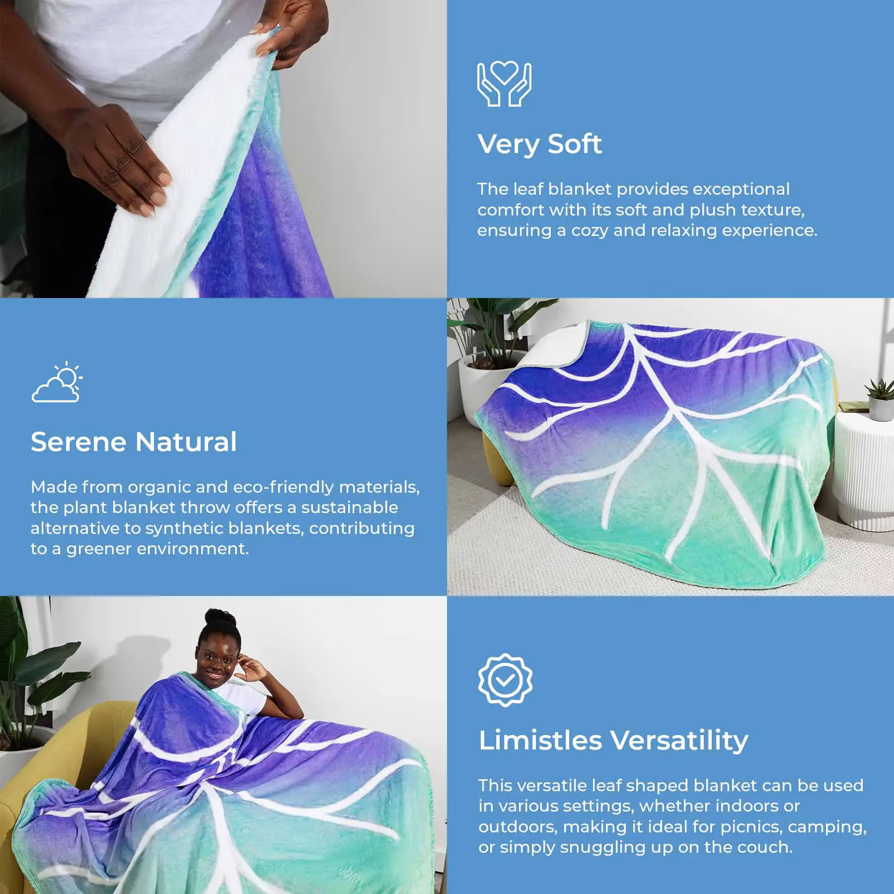
Color
Use contrasting colors for background and text. Complementary colors will make the text stand out while maintaining a visually appealing image.
Contrast plays a significant role in making text visible to the visually impaired. The text color should highly contrast with the background. Opt for colors that contrast well with the dominant colors in the image. In the below example, the seller added a dark green text box behind the copy itself to allow for easy readability—otherwise the white text would have been difficult to read on the light yellow background.
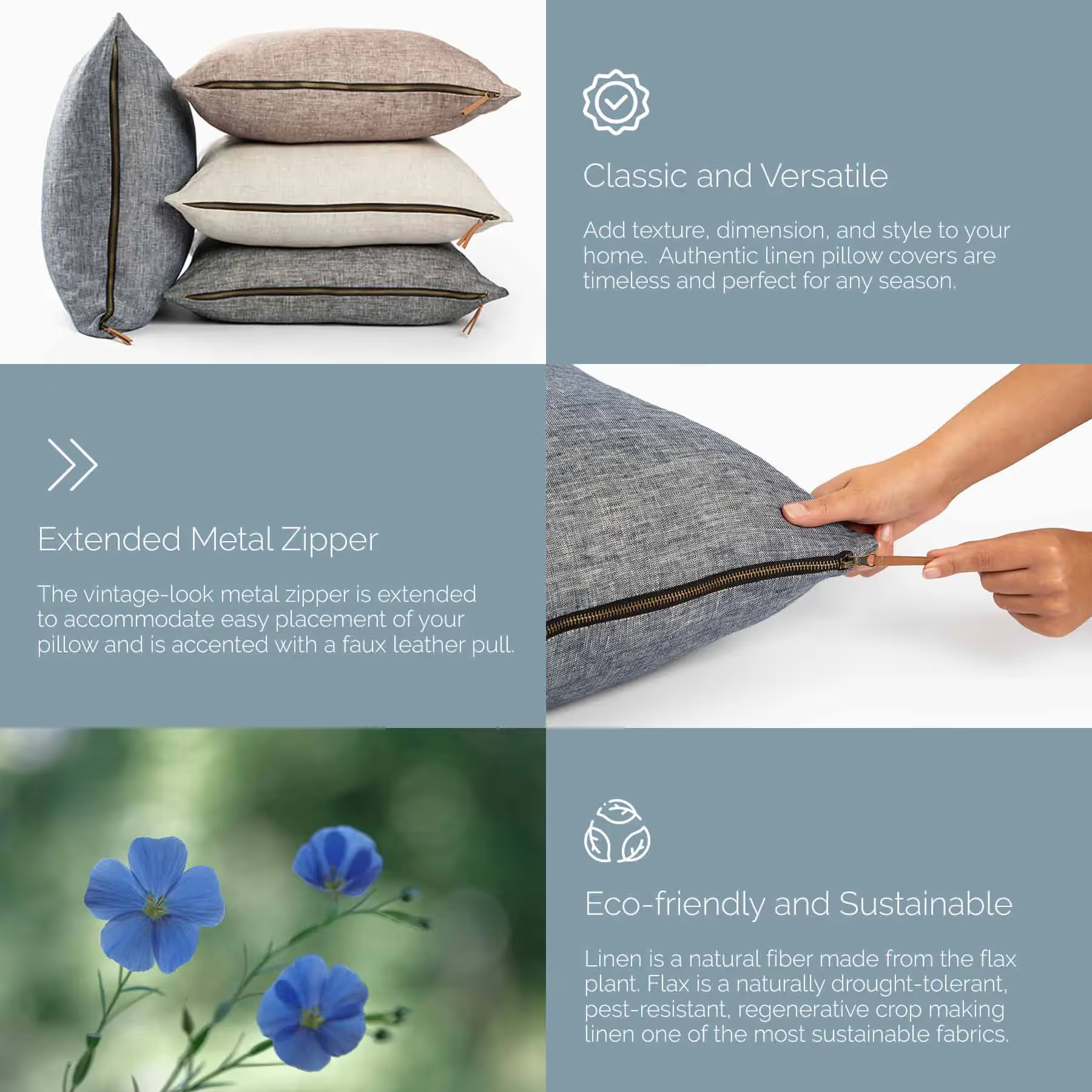
A common contrast ratio to aim for is 4.5:1. To achieve this, use lighter shades of text on dark backgrounds, or the reverse. Here are a few color combinations that work well:
- Black text on white background
- White text on black background
- Dark blue text on light blue background
- Light gray text on dark gray background
You can also add a subtle text shadow to help text stand out against a busy background. A semi-transparent background overlay between the text and image can also improve readability without obscuring the image.
Style
Using text style options like italics, bold, underline, bullet points, and shadows can improve your overlays. Italic and bold text can emphasize things like unique selling propositions or discounts. Bold styling can also increase legibility in certain contexts.
Remember to always maintain a balance between the text and the product image to prevent clutter or distractions.
Step 4: Arrange the text element on the image
Position the text strategically, considering image context. Place the text in an area of the photo where it isn’t competing with critical visual elements. Avoid covering essential features, faces, or objects.
Depending on the image and text content, you can opt for left, right, or centered alignment. The choice should be in harmony with the overall design and visual hierarchy.
To do this, you can use image editing software to overlay the text on the image. Free options include the soona media editor, GIMP, Canva, and Pixlr.
Add text to photos in just a few clicks >
Step 5: Review and adjust
Examine the final product and make any necessary adjustments. Double-check for spelling and grammatical errors, and ensure the text is clear and visible. Consider gathering feedback from others to make sure your analysis isn’t too biased.
Responsiveness
Don’t forget to make sure the text-overlay design is responsive and adaptable to different screen sizes and resolutions. The text must remain at the appropriate size and position regardless of the user’s device.
Check it out: The top 10 Amazon seller apps in 2024 >
Using text overlay in Amazon product listings: tips and best practices
Keep the following best practices and tips in mind when adding text to your Amazon photos:
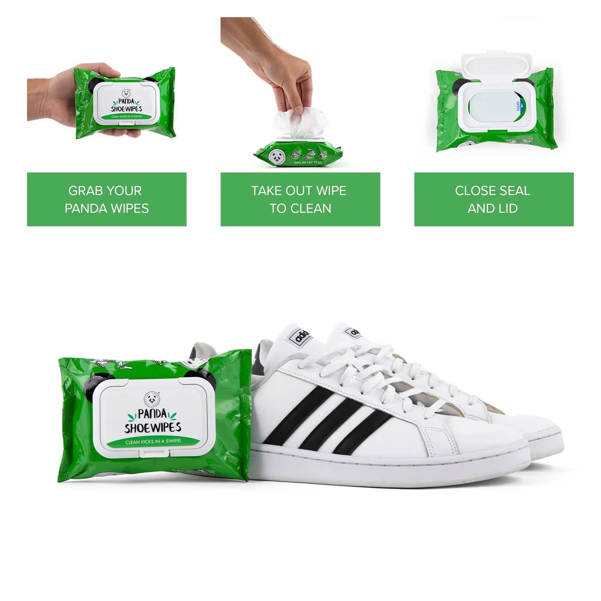
Eligibility and requirements
If you want toadding text overlays to Amazon product listing images in Seller Central, for example, you need to meet certain eligibility criteria. First and foremost, you’ll need to enroll in the Amazon Brand Registry program, ensuring your products are legitimately associated with a specific brand.
The product listing must also have a valid ASIN (Amazon Standard Identification Number). Each ASIN uniquely identifies the products within the Amazon marketplace and is required for any text overlay modifications. For multiple products, each product will have its individual ASIN, and changes must be made accordingly.
You’ll also want to consider Amazon’s requirements for the text overlay itself:
- Keep the text overlay succinct, informative, and easily comprehensible.
- The overlay shouldn’t cover essential product details in the image.
- Avoid using any offensive language or violating Amazon policies.
- Ensure the text is clearly visible, readable, and doesn’t blend with the image background.
- Information must be accurate and relevant. Exaggerated or false claims can lead to penalties imposed by Amazon, such as the removal of your product listing and account suspension.
Image options available with Amazon
There are various image options available for Amazon product listings to create a visually appealing and informative presentation:
- Main image: You need a high-quality photo of the product with a plain white background, filling 85% or more of the frame. This image is the first impression potential buyers will have of the product, so make sure it stands out.
- Additional images: These provide more context and visual information about the product. Additional images may include different angles, close-ups, and lifestyle images.
- Image header with text: This option allows you to combine a captivating header image with a clear and concise description. This layout can help highlight the most critical aspects and uses of the product.
- Single left image and single right image: These options display the product either on the left or right side of the frame, accompanied by descriptive text on the opposite side. This format allows for a clean and organized presentation of product features.
- Multiple image module A and standard multiple image module A: Both of these showcase several images in a single module. The distinction between the two is the layout and the number of images involved. These options help display various product aspects, such as color variants, accessories, or product use.
- Four image & text and four image/text quadrant: These layouts comprise four evenly spaced images accompanied by informative descriptions. They’re useful for presenting different features, functions, and use cases.
- Single image and highlights: This layout combines an eye-catching product photo with snapshot bullet points of the product’s key features. This setup is great for quickly drawing attention to the primary selling points.
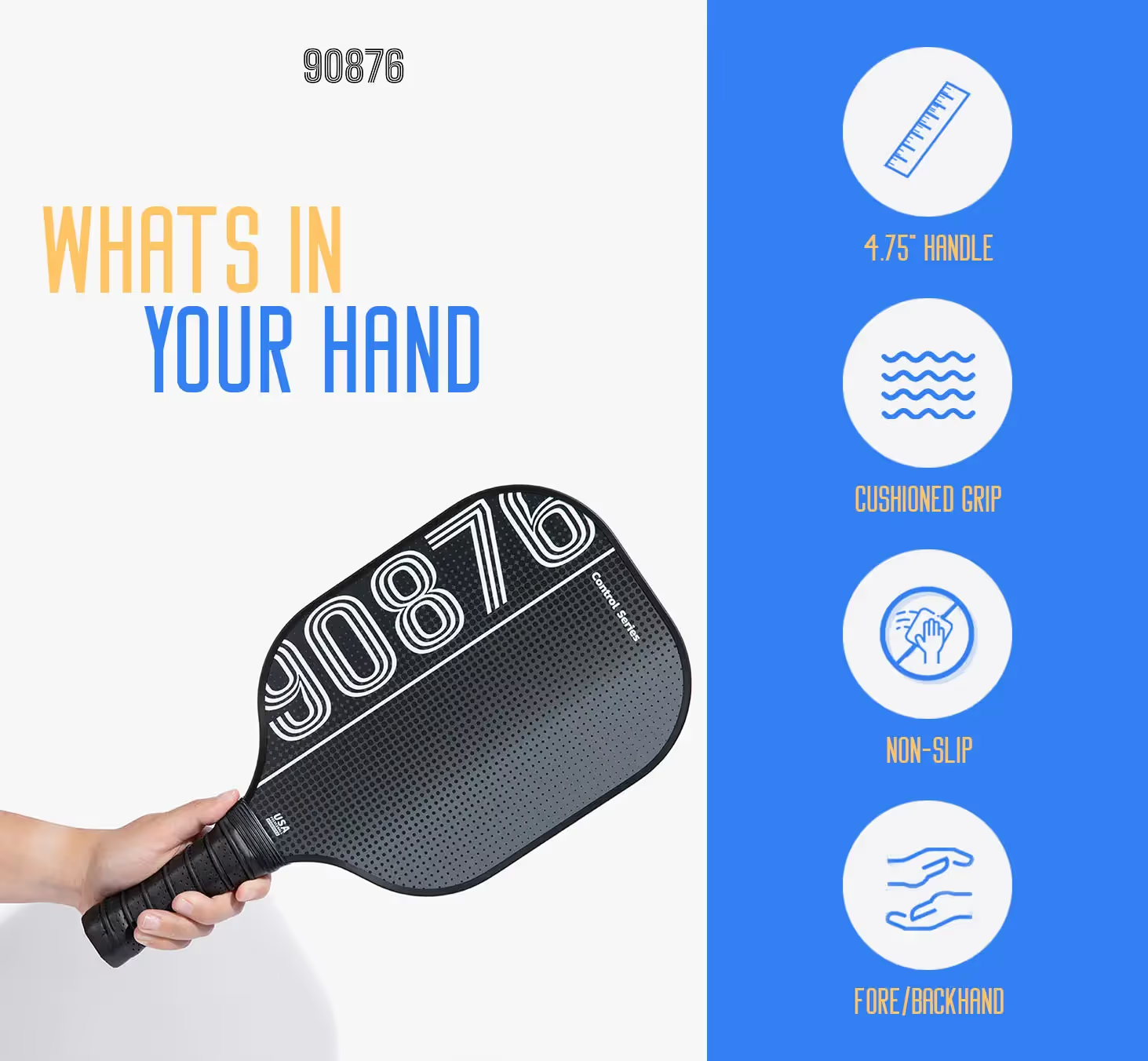
- Single image and sidebar: You can present a bold product image alongside a sidebar containing either bullet points, icons, or a combination of both. This option creates a visually clean and organized display of the product benefits and features.
- Three images and text: This layout takes advantage of three product images, emphasizing different angles or features of a product, accompanied by an informative text. It can suit various needs and adapt to a range of products.
Features of Amazon A+ and Premium A+ Content
Amazon has A+ content and Premium A+ content options for qualified sellers. These features help sellers showcase their products in a more engaging and informative way, using rich visuals and detailed information.
A+ content is an enhanced form of standard product descriptions, allowing you to feature in-depth information about products, such as usage, specifications, and benefits. It integrates high-quality images, informative comparisons, and engaging text to create persuasive product pages that ultimately lead to increased conversion rates.
Amazon’s invite-only Premium A+ content option takes the user experience to the next level with more advanced features to showcase their products. It features interactive modules, such as 360-degree image rotations, video clips, and interactive hotspots.
Both A+ and Premium A+ content can benefit from the use of text overlay on images. You can add key details such as product features, specifications, and benefits directly onto images, making it easier for customers to understand the unique selling points of your product at a glance.
Get what you need with soona’s Amazon A+ content basic pack >
Move forward with soona
Incorporating text overlays is a strategic and visually impactful approach to optimize your listings and online store. It not only enhances the aesthetic appeal of your images but also serves as a powerful tool to convey critical information, drive engagement, and ultimately boost sales.
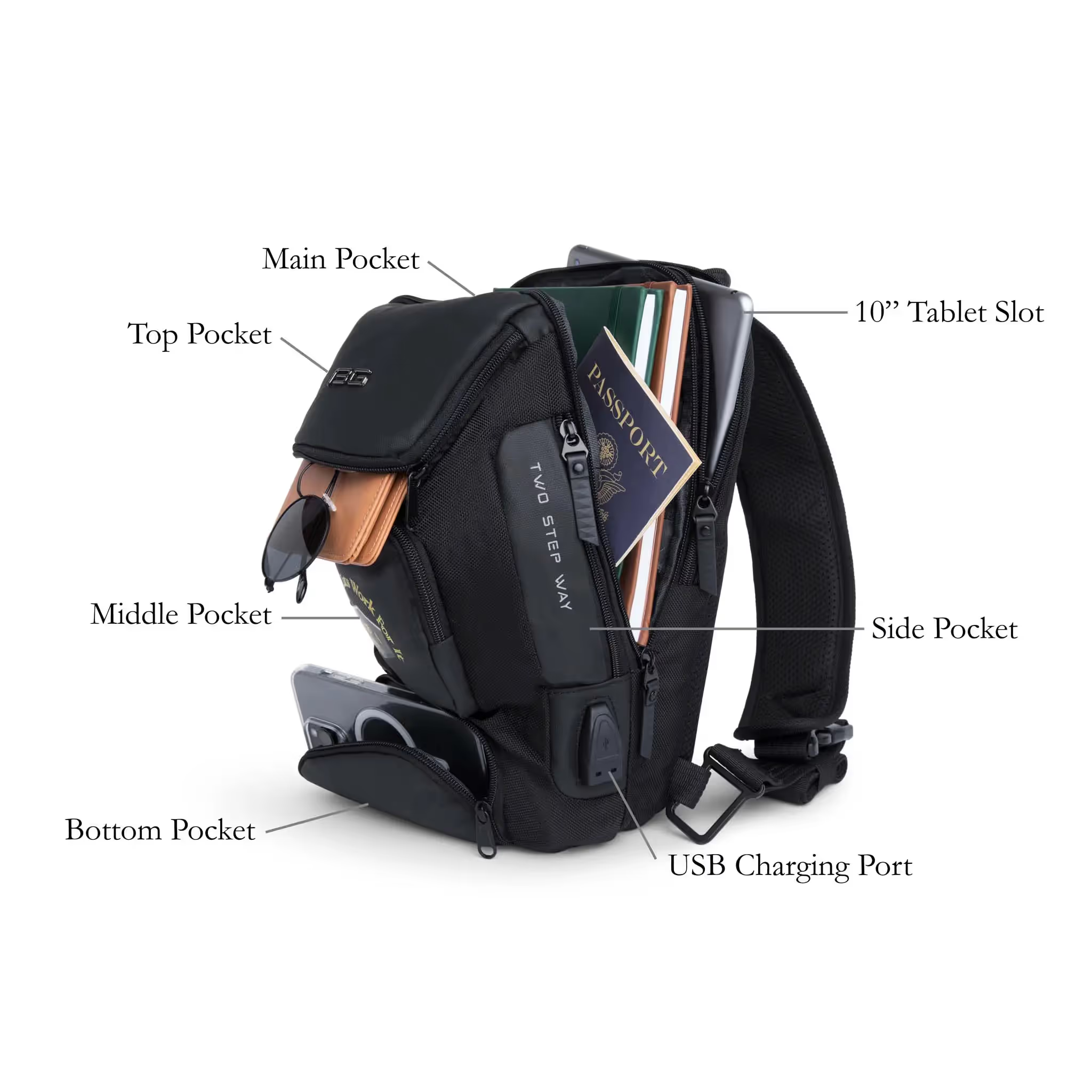
By ensuring accessibility, catching shoppers’ attention, and minimizing returns, text overlays contribute to a positive shopping experience. They also play a vital role in building brand awareness and loyalty.
Looking for help? Customize your images by adding text to fit whatever you sell, wherever you sell with our free media editor “add text to photo” feature >
{{tools-ad}}
Text overlay FAQs
How can I add text to a product image?
Text can be added to product images using image editing software such as Adobe Photoshop and GIMP, or online tools like Canva or Fotor. Make sure to maintain readability and clear contrast between the text and background, following Amazon's image guidelines.
Is it allowed to have text on images for Amazon product listings?
While Amazon generally discourages including text on product images, there might be exceptions in specific categories or cases where text conveys essential information. it’s essential to comply with Amazon’s guidelines for text overlay, ensuring the text is clear, concise, and doesn’t obstruct the product's visibility.
What tools can be used to overlay text on images online?
You can use the soona Media Editor’s add text to photo feature to overlay text on images online. With it, you can customize your images by adding text to fit whatever you sell, wherever you sell.
How do I ensure my text overlay complies with Amazon's formatting policies?
To ensure compliance with Amazon’s formatting policies, double-check the guidelines provided within the specific product category. Ensure the text overlay is clear, easy to read, and doesn’t interfere with the product’s visibility. Avoid using promotional language, inappropriate spacing, or excessive text that may detract from the product's presentation.
{{studio-ad}}
It’s important to always look for ways to optimize ecommerce product photos. One way to do that is by incorporating text overlays, a technique that involves placing text directly onto an image to provide additional context, information, or calls to action.
Text overlay has become increasingly popular—it can result in higher click-through rates (CTRs), better engagement, and improved sales.
However, it’s essential to carefully consider your approach when adding text overlays to your Amazon product images. There are certain guidelines and best practices to ensure your efforts are both effective and compliant with Amazon-specific requirements. In this post, let’s chat about how to use text overlay in your listings.
What is text overlay?
Text overlay is a design technique that involves placing text, or copy, on top of an image to create a compelling visual for various purposes, such as designing Amazon product listings or enhancing the user interface (UI).

Text overlay is a powerful tool for enhancing Amazon product listings. It involves placing copy (words) directly on the product images to provide key information and emphasize specific features.

Check this out: How to create Amazon infographics >
Why use text overlay for product photos
Make your content accessible to all shoppers
Text overlay can improve accessibility for your product content, especially for people with visual impairments, conditions, or disabilities. This not only makes product listings more accessible but also provides a better shopping experience for all users, regardless of their visual ability.
{{amazon-ad}}
To ensure your text overlay is supporting accessibility, use legible fonts in a color that’s easy to see and read over the background. We’ll get more into these design considerations in a bit!
Overlay by itself isn’t enough, though. Also make sure you properly tag overlays for screen reader compatibility. This means providing accurate and descriptive image alt text to describe the content of the image, as well as any embedded text. Screen readers rely on alt text to convey information to visually impaired users, so don’t overlook this step when creating your overlays.
Accessibility in motion: Creating accessible videos: best practices for video accessibility >
Drive clicks and conversions
One of the major benefits of using text overlay is the ability to communicate essential product information at a glance. Text can catch customer attention, making them curious about the product.
Overlays also bring improved visual hierarchy to product images making it easier for shoppers to quickly get the most important information. Properly placing the text on the image ensures that isn’t intrusive, but rather complements the overall visual composition.
By adding a concise and visually appealing tagline or call-to-action (CTA), you can motivate potential customers to explore the product further and even make a purchase—especially helpful when selling products with a unique selling proposition or a limited-time offer.
{{studio-ad}}
Offset returns and negative reviews
Providing clear and accurate information about the product and its features allows customers to have a better understanding of their purchase, which can lead to higher satisfaction and fewer returns.
The return process isn’t only costly, but it also means you’ve missed out on a sale. Excessive negative reviews and returns can impact your visibility in the algorithm and Amazon performance metrics, potentially affecting account standings and access to specific selling features, such as the Buy Box.
Promote brand awareness
Text overlay helps you effectively communicate your brand message and express your visual brand identity. An image with a well-placed overlay can emphasize your product’s unique selling points, highlight special features, or offer promotional information.
You can use text overlay to reinforce your brand message, reinforcing a slogan or core values. Overlaying creative and informative text can uplift product images, making them more engaging and appealing to potential customers.
Bookmark this: Create stunning Amazon infographics: a step-by-step guide >
How to overlay text on image: 5 steps
Follow these five steps to add text to your photos:
Step 1: Choose an appropriate image
Select an image that represents your product well and has enough space to accommodate the overlay text. Make sure the background isn’t too busy and doesn’t visually clash with the copy, ensuring it remains legible.
For example, this image has lots of empty space on all sides, which provides a great canvas:

Step 2: Write your text
Always prioritize keeping the listing informative and visually appealing, with a focus on the product and its features. Start by identifying the essential information that needs to be communicated to the viewer. Then you can start writing! ✍️
Limit yourself to the essential info, keywords, or product features—overdoing it can overwhelm your audience. This also enables visually impaired users to process the information quickly and efficiently. Keep the words concise and straightforward, using short phrases instead of long sentences. You could even use bulleted lists.
You really don’t need to go overboard. This example only shows product dimensions in its text overlay:

Highlight product features or benefits that differentiate your product from the competition. You can also highlight promotions and discounts—it’s an excellent way to call attention to time-sensitive promotions, product launches, or limited-time offers.
You might also include a strong CTA to guide shoppers towards taking the desired action, like adding the item to their shopping cart or exploring more product offerings. Use actionable phrases like “Buy Now!” or “Limited Stock Available!”
Step 3: Format your text overlay
Consider the following characteristics when formatting your text:
- Font
- Size
- Color
- Style
Font
When overlaying text on an image, choose a readable and aesthetically pleasing font. It should be clear and legible when placed on your image.
Sans Serif fonts work great, as they’re more comfortable to read than their Serif counterparts. Examples include Arial, Helvetica, and Tahoma.
See how easy it is to read the font in this example:

Ultimately, your text styles will depend on the desired visual impact and overall branding.
Size
The text should be large enough for legibility while not overpowering the image. Maintain a balance between being visible and not distracting from the primary visual content, even when the image is scaled down. Use different font sizes to create a clear hierarchy of information.
See how the below example has larger font sizes for subheadings and smaller font sizes for the supporting text. The subheadings are the most important, so they’re sized larger.

Color
Use contrasting colors for background and text. Complementary colors will make the text stand out while maintaining a visually appealing image.
Contrast plays a significant role in making text visible to the visually impaired. The text color should highly contrast with the background. Opt for colors that contrast well with the dominant colors in the image. In the below example, the seller added a dark green text box behind the copy itself to allow for easy readability—otherwise the white text would have been difficult to read on the light yellow background.

A common contrast ratio to aim for is 4.5:1. To achieve this, use lighter shades of text on dark backgrounds, or the reverse. Here are a few color combinations that work well:
- Black text on white background
- White text on black background
- Dark blue text on light blue background
- Light gray text on dark gray background
You can also add a subtle text shadow to help text stand out against a busy background. A semi-transparent background overlay between the text and image can also improve readability without obscuring the image.
Style
Using text style options like italics, bold, underline, bullet points, and shadows can improve your overlays. Italic and bold text can emphasize things like unique selling propositions or discounts. Bold styling can also increase legibility in certain contexts.
Remember to always maintain a balance between the text and the product image to prevent clutter or distractions.
Step 4: Arrange the text element on the image
Position the text strategically, considering image context. Place the text in an area of the photo where it isn’t competing with critical visual elements. Avoid covering essential features, faces, or objects.
Depending on the image and text content, you can opt for left, right, or centered alignment. The choice should be in harmony with the overall design and visual hierarchy.
To do this, you can use image editing software to overlay the text on the image. Free options include the soona media editor, GIMP, Canva, and Pixlr.
Add text to photos in just a few clicks >
Step 5: Review and adjust
Examine the final product and make any necessary adjustments. Double-check for spelling and grammatical errors, and ensure the text is clear and visible. Consider gathering feedback from others to make sure your analysis isn’t too biased.
Responsiveness
Don’t forget to make sure the text-overlay design is responsive and adaptable to different screen sizes and resolutions. The text must remain at the appropriate size and position regardless of the user’s device.
Check it out: The top 10 Amazon seller apps in 2024 >
Using text overlay in Amazon product listings: tips and best practices
Keep the following best practices and tips in mind when adding text to your Amazon photos:

Eligibility and requirements
If you want toadding text overlays to Amazon product listing images in Seller Central, for example, you need to meet certain eligibility criteria. First and foremost, you’ll need to enroll in the Amazon Brand Registry program, ensuring your products are legitimately associated with a specific brand.
The product listing must also have a valid ASIN (Amazon Standard Identification Number). Each ASIN uniquely identifies the products within the Amazon marketplace and is required for any text overlay modifications. For multiple products, each product will have its individual ASIN, and changes must be made accordingly.
You’ll also want to consider Amazon’s requirements for the text overlay itself:
- Keep the text overlay succinct, informative, and easily comprehensible.
- The overlay shouldn’t cover essential product details in the image.
- Avoid using any offensive language or violating Amazon policies.
- Ensure the text is clearly visible, readable, and doesn’t blend with the image background.
- Information must be accurate and relevant. Exaggerated or false claims can lead to penalties imposed by Amazon, such as the removal of your product listing and account suspension.
Image options available with Amazon
There are various image options available for Amazon product listings to create a visually appealing and informative presentation:
- Main image: You need a high-quality photo of the product with a plain white background, filling 85% or more of the frame. This image is the first impression potential buyers will have of the product, so make sure it stands out.
- Additional images: These provide more context and visual information about the product. Additional images may include different angles, close-ups, and lifestyle images.
- Image header with text: This option allows you to combine a captivating header image with a clear and concise description. This layout can help highlight the most critical aspects and uses of the product.
- Single left image and single right image: These options display the product either on the left or right side of the frame, accompanied by descriptive text on the opposite side. This format allows for a clean and organized presentation of product features.
- Multiple image module A and standard multiple image module A: Both of these showcase several images in a single module. The distinction between the two is the layout and the number of images involved. These options help display various product aspects, such as color variants, accessories, or product use.
- Four image & text and four image/text quadrant: These layouts comprise four evenly spaced images accompanied by informative descriptions. They’re useful for presenting different features, functions, and use cases.
- Single image and highlights: This layout combines an eye-catching product photo with snapshot bullet points of the product’s key features. This setup is great for quickly drawing attention to the primary selling points.
- Single image and sidebar: You can present a bold product image alongside a sidebar containing either bullet points, icons, or a combination of both. This option creates a visually clean and organized display of the product benefits and features.
- Three images and text: This layout takes advantage of three product images, emphasizing different angles or features of a product, accompanied by an informative text. It can suit various needs and adapt to a range of products.

Features of Amazon A+ and Premium A+ Content
Amazon has A+ content and Premium A+ content options for qualified sellers. These features help sellers showcase their products in a more engaging and informative way, using rich visuals and detailed information.
A+ content is an enhanced form of standard product descriptions, allowing you to feature in-depth information about products, such as usage, specifications, and benefits. It integrates high-quality images, informative comparisons, and engaging text to create persuasive product pages that ultimately lead to increased conversion rates.
Amazon’s invite-only Premium A+ content option takes the user experience to the next level with more advanced features to showcase their products. It features interactive modules, such as 360-degree image rotations, video clips, and interactive hotspots.
Both A+ and Premium A+ content can benefit from the use of text overlay on images. You can add key details such as product features, specifications, and benefits directly onto images, making it easier for customers to understand the unique selling points of your product at a glance.
Get what you need with soona’s Amazon A+ content basic pack >
Move forward with soona
Incorporating text overlays is a strategic and visually impactful approach to optimize your listings and online store. It not only enhances the aesthetic appeal of your images but also serves as a powerful tool to convey critical information, drive engagement, and ultimately boost sales.

By ensuring accessibility, catching shoppers’ attention, and minimizing returns, text overlays contribute to a positive shopping experience. They also play a vital role in building brand awareness and loyalty.
Looking for help? Customize your images by adding text to fit whatever you sell, wherever you sell with our free media editor “add text to photo” feature >
{{tools-ad}}
Text overlay FAQs
How can I add text to a product image?
Text can be added to product images using image editing software such as Adobe Photoshop and GIMP, or online tools like Canva or Fotor. Make sure to maintain readability and clear contrast between the text and background, following Amazon's image guidelines.
Is it allowed to have text on images for Amazon product listings?
While Amazon generally discourages including text on product images, there might be exceptions in specific categories or cases where text conveys essential information. it’s essential to comply with Amazon’s guidelines for text overlay, ensuring the text is clear, concise, and doesn’t obstruct the product's visibility.
What tools can be used to overlay text on images online?
You can use the soona Media Editor’s add text to photo feature to overlay text on images online. With it, you can customize your images by adding text to fit whatever you sell, wherever you sell.
How do I ensure my text overlay complies with Amazon's formatting policies?
To ensure compliance with Amazon’s formatting policies, double-check the guidelines provided within the specific product category. Ensure the text overlay is clear, easy to read, and doesn’t interfere with the product’s visibility. Avoid using promotional language, inappropriate spacing, or excessive text that may detract from the product's presentation.
{{studio-ad}}


.avif)


