

10 Amazon Brand Store Examples: Brands That Nail Their Design Modules
Looking for Amazon storefront inspiration? These 10 brands prove that thoughtful photography and design can transform basic Amazon product listings into a memorable brand experience. Whether you're launching your first Amazon brand store or refreshing an existing one, here's what the pros are doing right.
1. Salt and Stone

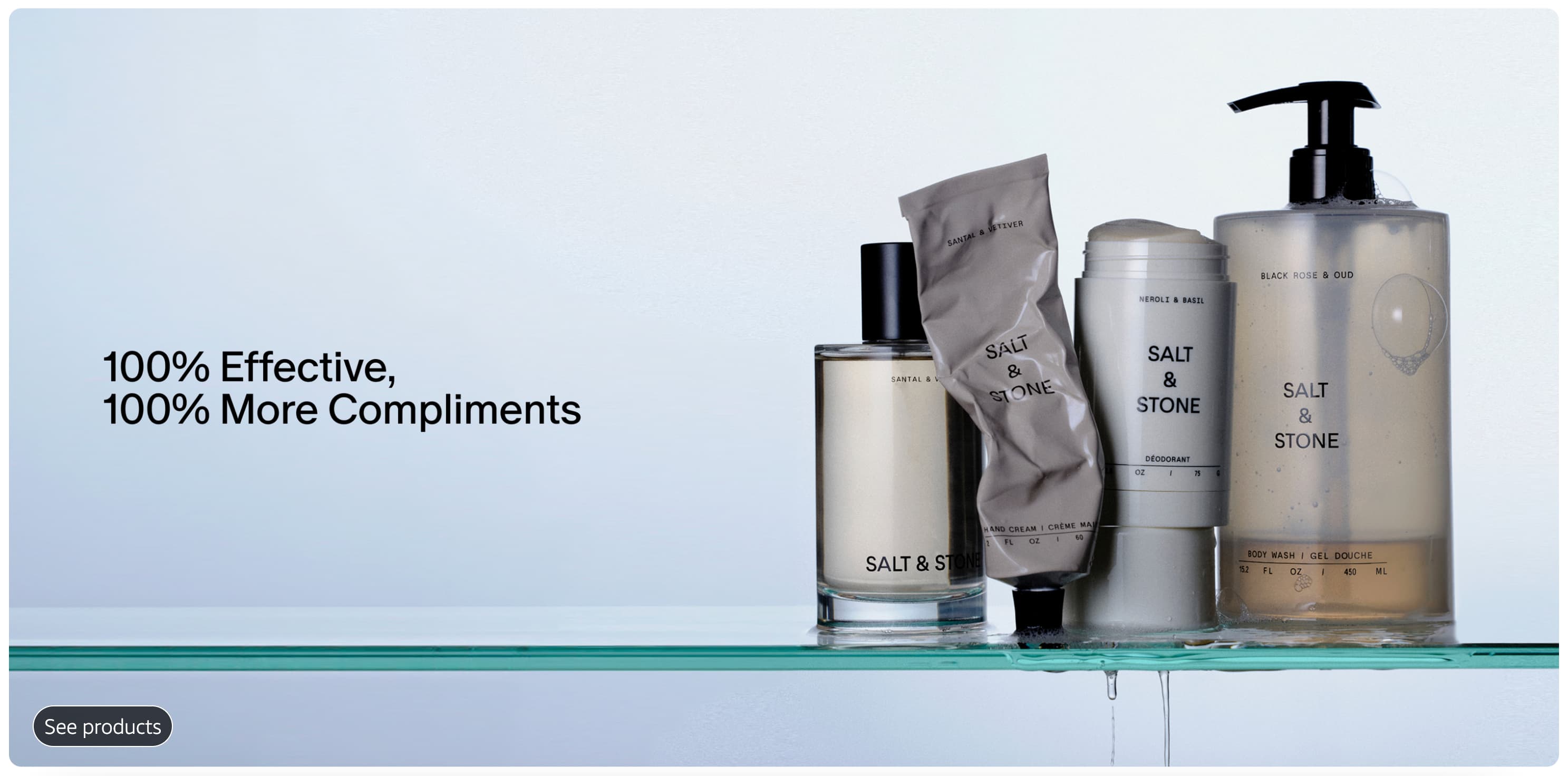
Salt and Stone's storefront feels more like a lifestyle magazine than a product catalog. Their hero images use earthy, natural tones that immediately communicate their clean ingredient story. Each module flows into the next with consistent color grading and styling. The kind of cohesive visual identity that comes from professional product photography. The lifestyle shots show their deodorants and body washes in minimalist bathroom settings that feel aspirational but achievable.
See the store.
2. Loftie

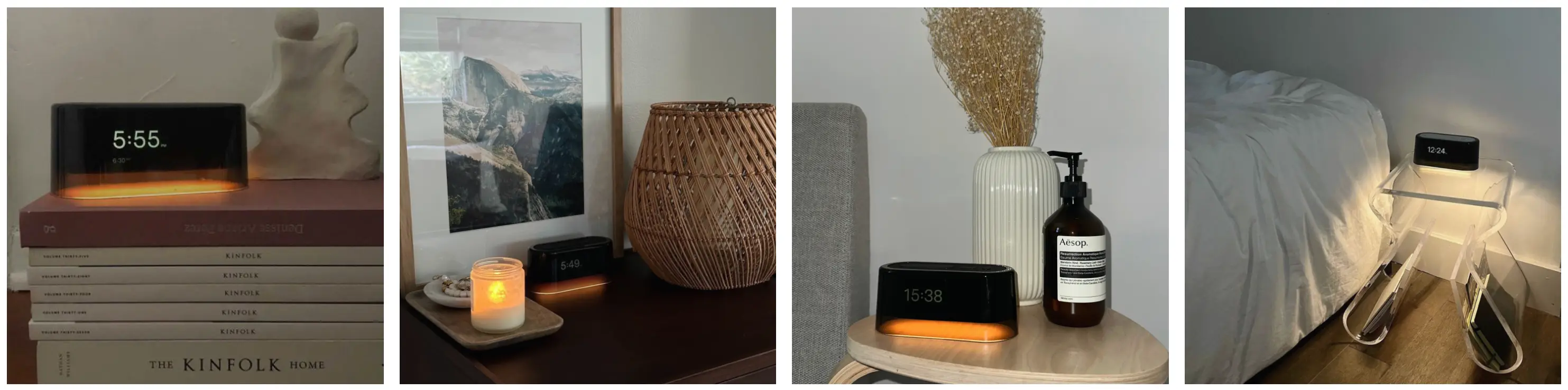
Loftie nails the authenticity factor with storefront photography that looks like it came straight from customer homes. Their alarm clock is shown on real nightstands, in real bedrooms, with morning light streaming through actual windows. The mix of professional shots and UGC-style images creates a "this could be your bedroom" vibe that's effective. The lifestyle content feels genuine rather than staged, building trust with shoppers who are skeptical of overproduced Amazon photography.
3. Rains

Rains uses their storefront to tell a weather-resistant story through photography alone. The color palette stays consistently moody and minimalist, with pops of their signature colors standing out against neutral backgrounds. The product photography clearly shows fabric texture and construction details through tight shots and multiple angles, giving customers confidence in the quality and craftsmanship.
4. Aesop

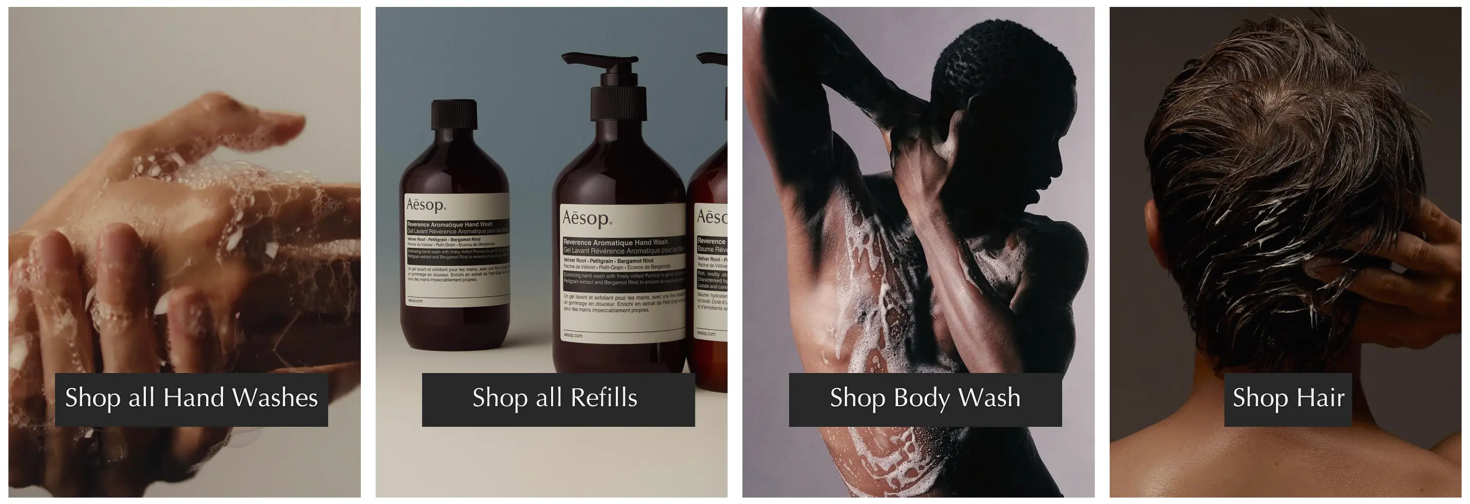
Aesop brings their signature minimalist aesthetic to Amazon. High-contrast product photography on neutral backgrounds lets the distinctive bottle designs shine. The brand uses generous white space in their modules instead of cramming in too much information. Each product shot is lit and styled with precision. It's proof that investing in high-quality ecommerce photography pays off in perceived value.
5. Seed

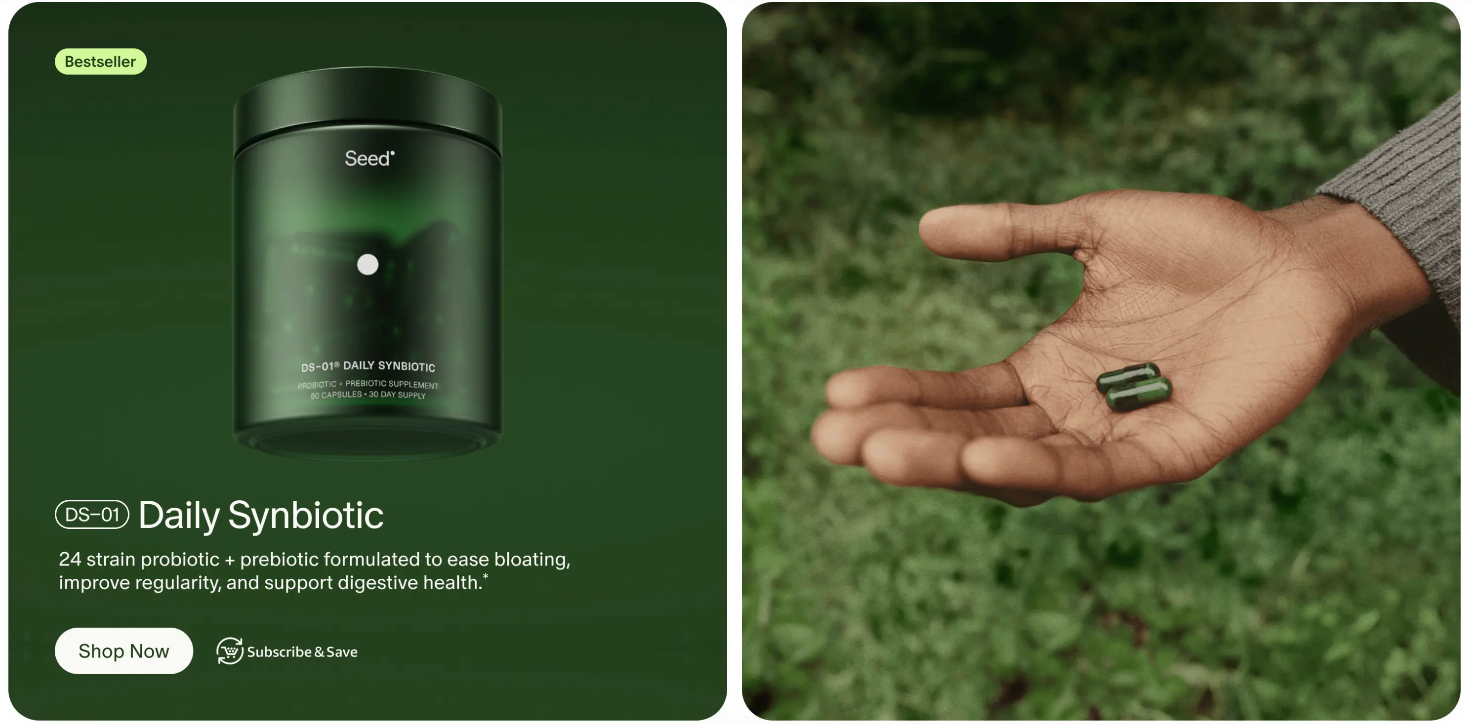
Seed's storefront brings a scientific, editorial approach to supplement photography. They use clean product shots paired with infographic-style modules that explain complex health concepts visually. The photography is crisp and clinical without feeling cold. Their design modules alternate between product focus and lifestyle context, showing who takes their probiotics and why, making the science feel accessible and relevant.
6. Swoon

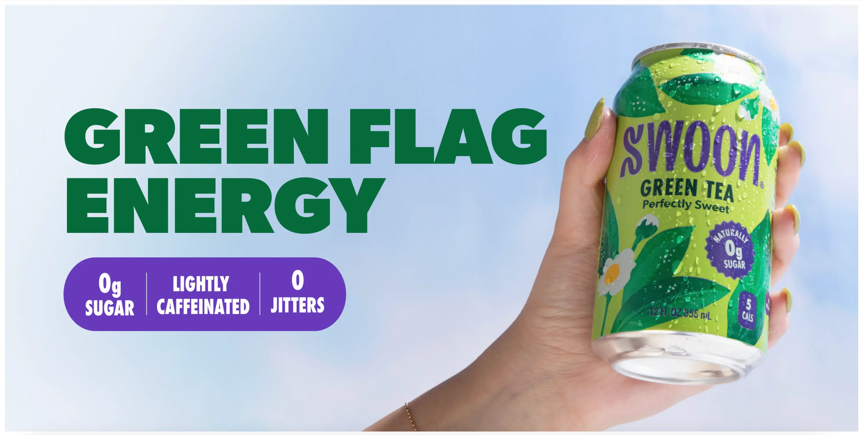
Swoon's storefront uses bright, energetic photography that makes their zero sugar beverages look refreshing and appealing. The lifestyle shots show real moments of people enjoying their drinks, from morning routines to afternoon pick-me-ups. Their product photography uses clean backgrounds that let the colorful can designs stand out. The modules mix tight product shots with lifestyle context, and the consistent color palette across all images creates a cohesive brand story that emphasizes their better-for-you positioning.
7. Stanley

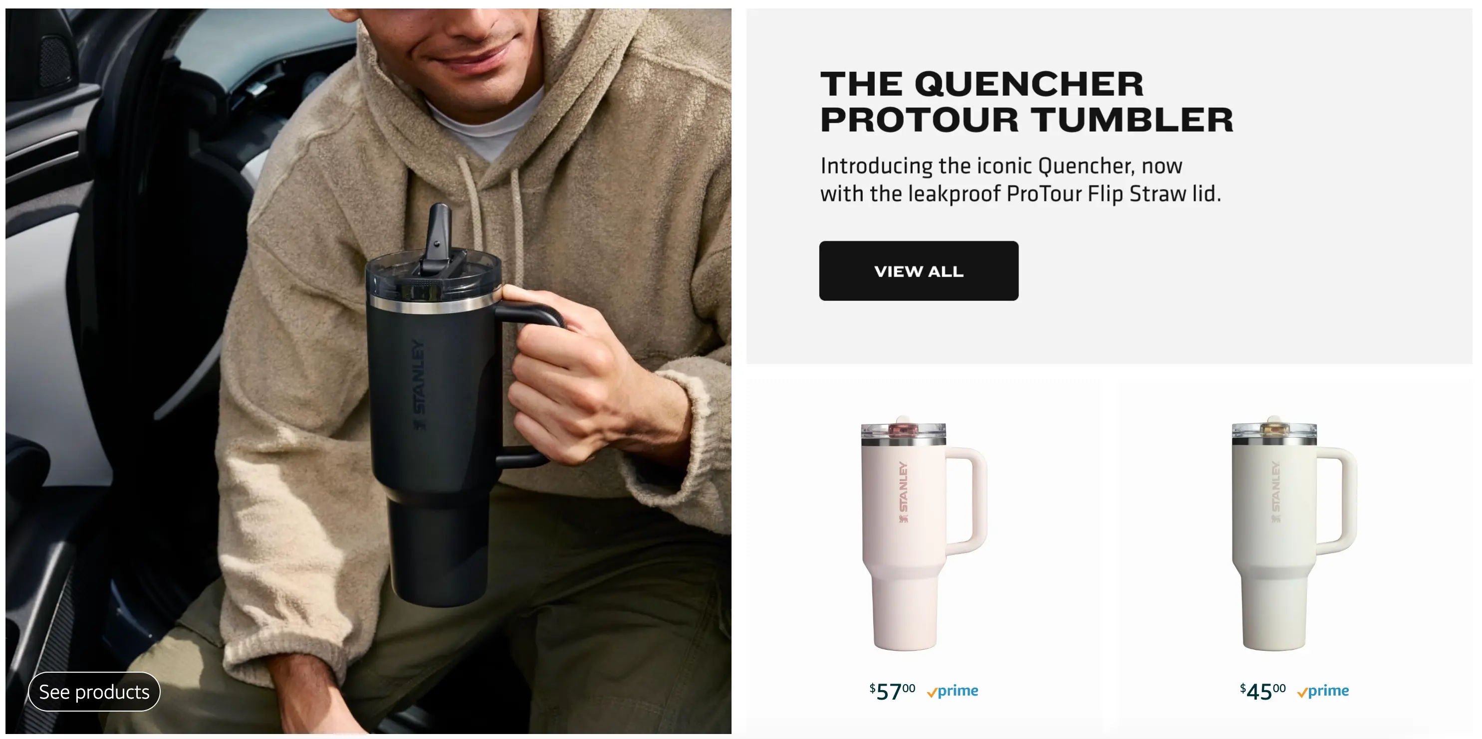
Stanley uses professional lifestyle photography that feels authentic and relatable. Their storefront modules show tumblers at job sites, in cars, and on outdoor adventures. The lifestyle content captures real-world use cases without feeling overly staged. Bold typography and clear product categorization make shopping easy. It's a good example of how professional photography can still feel genuine.
8. Apple

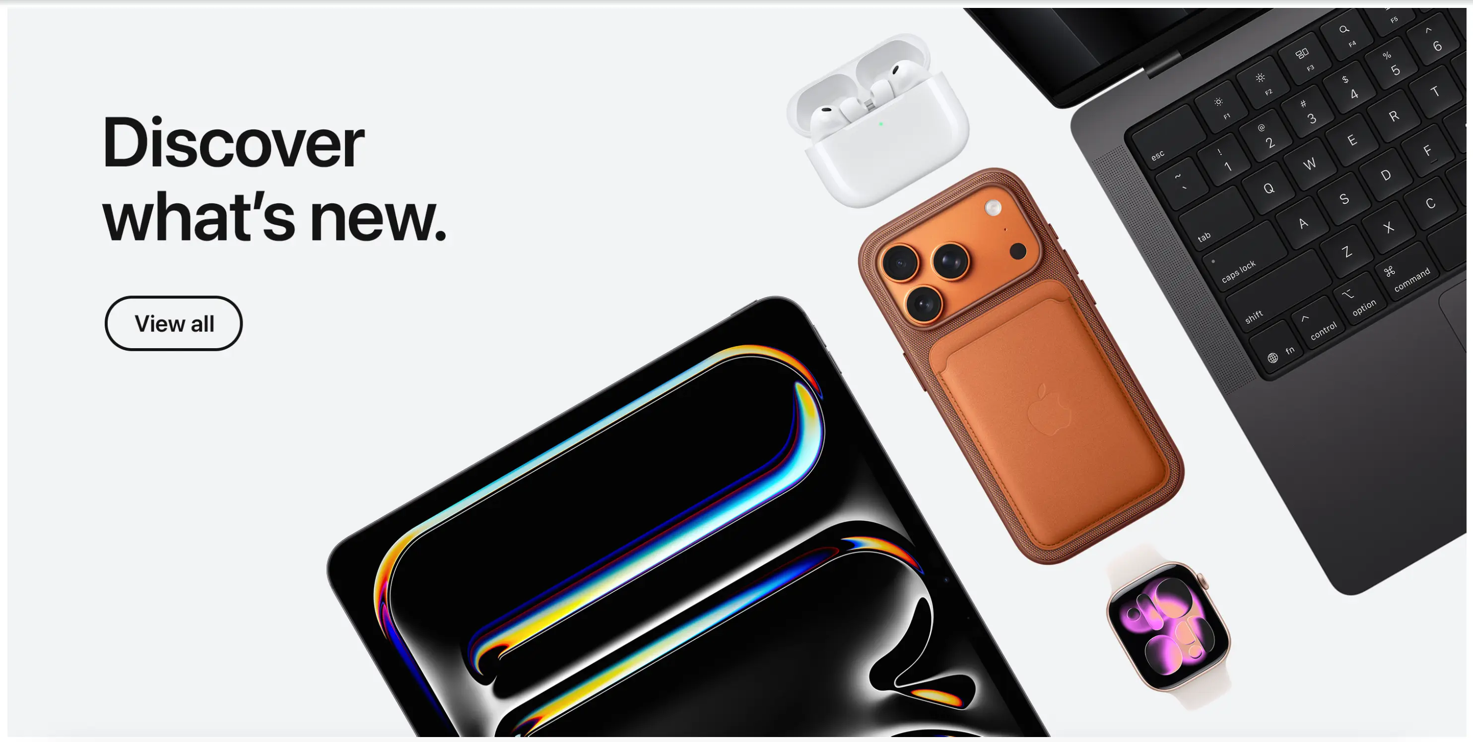
Apple's Amazon storefront is clean and product-focused. White backgrounds, consistent lighting, and precise product photography that showcases every detail. Their design modules use minimal text, relying instead on high-quality images that demonstrate features and use cases. The storefront mirrors their website aesthetic, maintaining brand consistency across all sales channels. A great case study in making an Amazon page feel like your own brand.
9. Kyte Baby
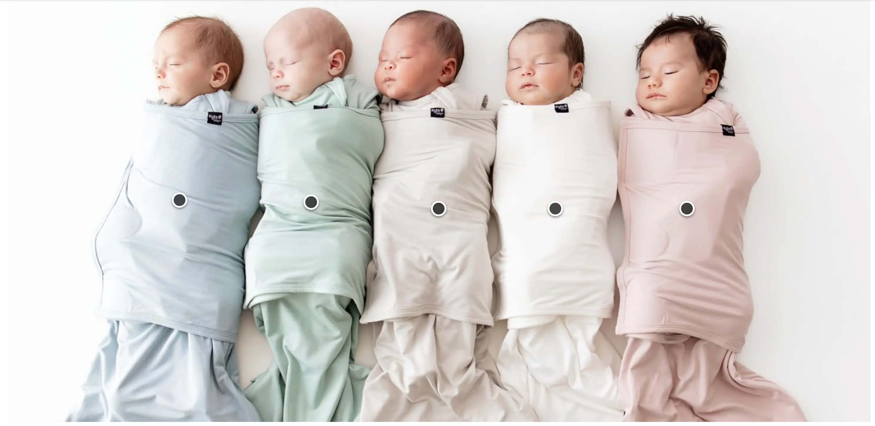
Kyte Baby's storefront photography is soft and perfectly on-brand for a children's sleepwear company. Every image features real babies and toddlers (not overly styled models) in natural light. Their color story of muted pastels and neutrals carries through every module. The lifestyle imagery shows products being worn, washed, and lived in, which directly addresses parent concerns about durability and comfort.
10. Casper

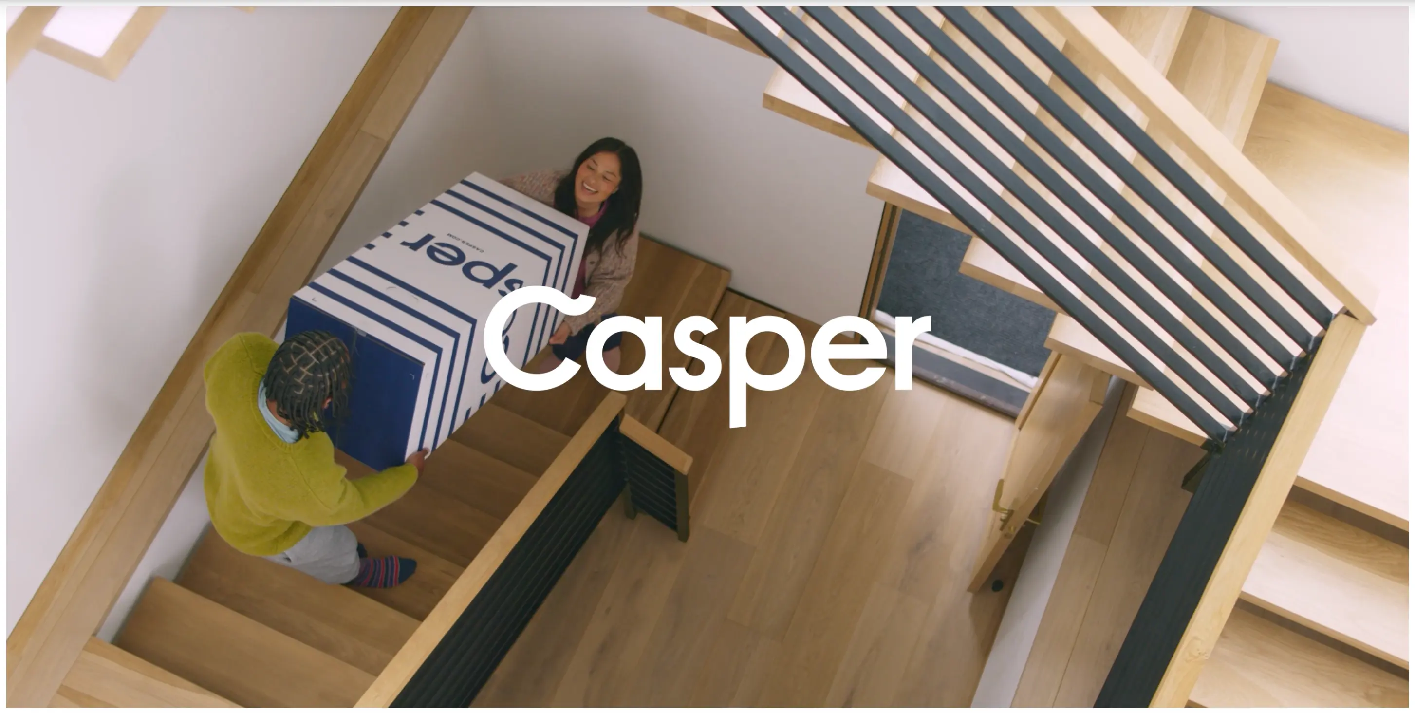
Casper's storefront creates a calm, sleep-focused atmosphere through soft color palettes and dreamy bedroom photography. Their modules use a mix of clean product shots on simple backgrounds and lifestyle images that show their mattresses and bedding in real bedroom settings. The photography consistently features natural light and peaceful styling that reinforces their "better sleep" message. They do a great job showing scale and context for products that are hard to visualize online. The lifestyle photography feels aspirational without being unrealistic, and their use of consistent styling across all products creates a cohesive shopping experience.
The Common Thread
What these top Amazon storefronts share:
- Professional product photography
- Consistent photography style
- Lifestyle context that shows products in use
- Quick look product modules for easy add-to-cart moments
- Design modules that guide shoppers through the brand story
None of this happens by accident. It's the result of strategic planning and professional content creation.
Ready to make the most of your Amazon Brand Store?
Chat with an expert.
10 Amazon Brand Store Examples: Brands That Nail Their Design Modules
Looking for Amazon storefront inspiration? These 10 brands prove that thoughtful photography and design can transform basic Amazon product listings into a memorable brand experience. Whether you're launching your first Amazon brand store or refreshing an existing one, here's what the pros are doing right.
1. Salt and Stone
Salt and Stone's storefront feels more like a lifestyle magazine than a product catalog. Their hero images use earthy, natural tones that immediately communicate their clean ingredient story. Each module flows into the next with consistent color grading and styling. The kind of cohesive visual identity that comes from professional product photography. The lifestyle shots show their deodorants and body washes in minimalist bathroom settings that feel aspirational but achievable.
See the store.
2. Loftie
Loftie nails the authenticity factor with storefront photography that looks like it came straight from customer homes. Their alarm clock is shown on real nightstands, in real bedrooms, with morning light streaming through actual windows. The mix of professional shots and UGC-style images creates a "this could be your bedroom" vibe that's effective. The lifestyle content feels genuine rather than staged, building trust with shoppers who are skeptical of overproduced Amazon photography.
3. Rains
Rains uses their storefront to tell a weather-resistant story through photography alone. The color palette stays consistently moody and minimalist, with pops of their signature colors standing out against neutral backgrounds. The product photography clearly shows fabric texture and construction details through tight shots and multiple angles, giving customers confidence in the quality and craftsmanship.
4. Aesop
Aesop brings their signature minimalist aesthetic to Amazon. High-contrast product photography on neutral backgrounds lets the distinctive bottle designs shine. The brand uses generous white space in their modules instead of cramming in too much information. Each product shot is lit and styled with precision. It's proof that investing in high-quality ecommerce photography pays off in perceived value.
5. Seed
Seed's storefront brings a scientific, editorial approach to supplement photography. They use clean product shots paired with infographic-style modules that explain complex health concepts visually. The photography is crisp and clinical without feeling cold. Their design modules alternate between product focus and lifestyle context, showing who takes their probiotics and why, making the science feel accessible and relevant.
6. Swoon
Swoon's storefront uses bright, energetic photography that makes their zero sugar beverages look refreshing and appealing. The lifestyle shots show real moments of people enjoying their drinks, from morning routines to afternoon pick-me-ups. Their product photography uses clean backgrounds that let the colorful can designs stand out. The modules mix tight product shots with lifestyle context, and the consistent color palette across all images creates a cohesive brand story that emphasizes their better-for-you positioning.
7. Stanley
Stanley uses professional lifestyle photography that feels authentic and relatable. Their storefront modules show tumblers at job sites, in cars, and on outdoor adventures. The lifestyle content captures real-world use cases without feeling overly staged. Bold typography and clear product categorization make shopping easy. It's a good example of how professional photography can still feel genuine.
8. Apple
Apple's Amazon storefront is clean and product-focused. White backgrounds, consistent lighting, and precise product photography that showcases every detail. Their design modules use minimal text, relying instead on high-quality images that demonstrate features and use cases. The storefront mirrors their website aesthetic, maintaining brand consistency across all sales channels. A great case study in making an Amazon page feel like your own brand.
9. Kyte Baby
Kyte Baby's storefront photography is soft and perfectly on-brand for a children's sleepwear company. Every image features real babies and toddlers (not overly styled models) in natural light. Their color story of muted pastels and neutrals carries through every module. The lifestyle imagery shows products being worn, washed, and lived in, which directly addresses parent concerns about durability and comfort.
10. Casper
Casper's storefront creates a calm, sleep-focused atmosphere through soft color palettes and dreamy bedroom photography. Their modules use a mix of clean product shots on simple backgrounds and lifestyle images that show their mattresses and bedding in real bedroom settings. The photography consistently features natural light and peaceful styling that reinforces their "better sleep" message. They do a great job showing scale and context for products that are hard to visualize online. The lifestyle photography feels aspirational without being unrealistic, and their use of consistent styling across all products creates a cohesive shopping experience.
The Common Thread
What these top Amazon storefronts share:
- Professional product photography
- Consistent photography style
- Lifestyle context that shows products in use
- Quick look product modules for easy add-to-cart moments
- Design modules that guide shoppers through the brand story
None of this happens by accident. It's the result of strategic planning and professional content creation.
Ready to make the most of your Amazon Brand Store?
Chat with an expert.

.avif)