
Your brand is sending a message. Is it the right one?
Why visual consistency matters more than any single great photo.
Imagine walking into a high-end boutique. The lighting is warm, the displays are carefully arranged, the packaging is clean and uniform. Then tucked in the corner, there's a dusty folding table. Products piled up with no organization, damaged packaging, no presentation. Same prices as everything else in the store.
Would you trust those products the same way? Probably not.
That corner table is what your product page looks like when your photography isn't consistent.
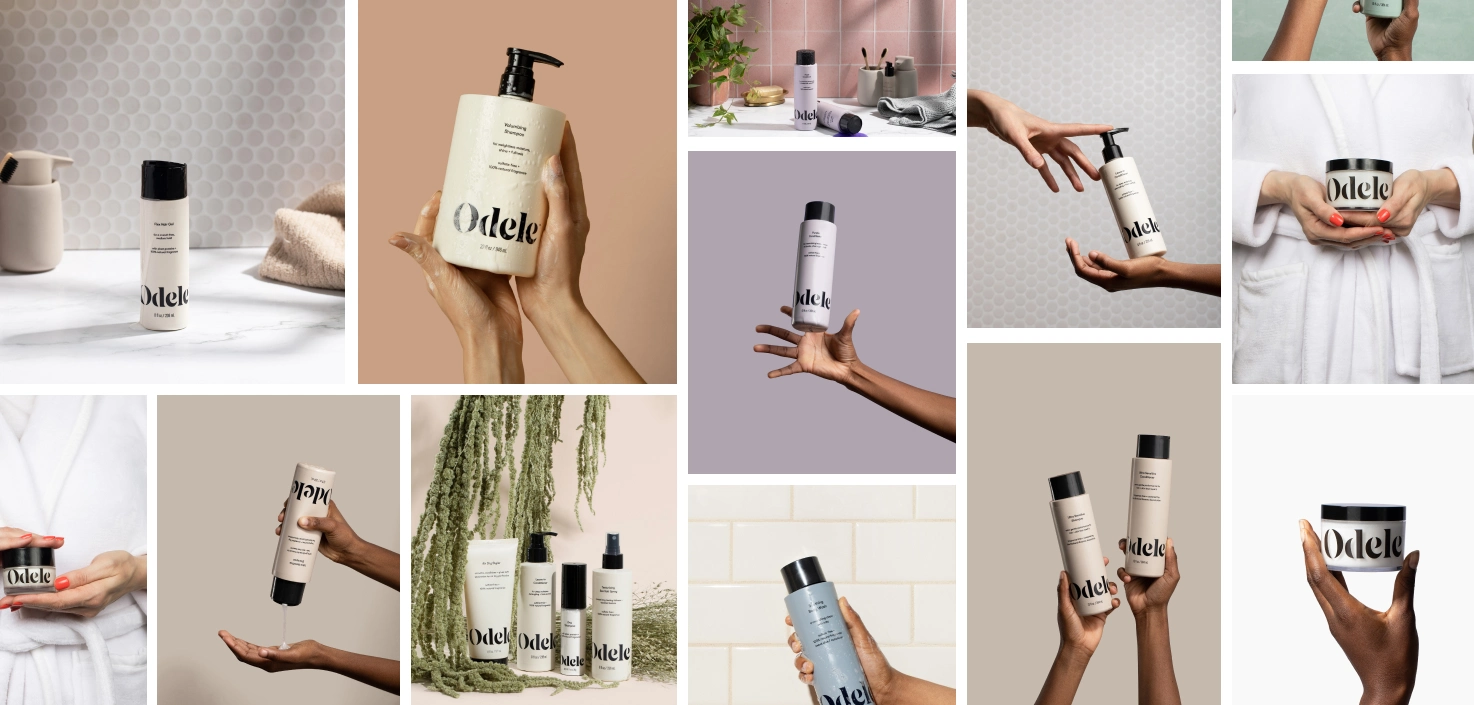
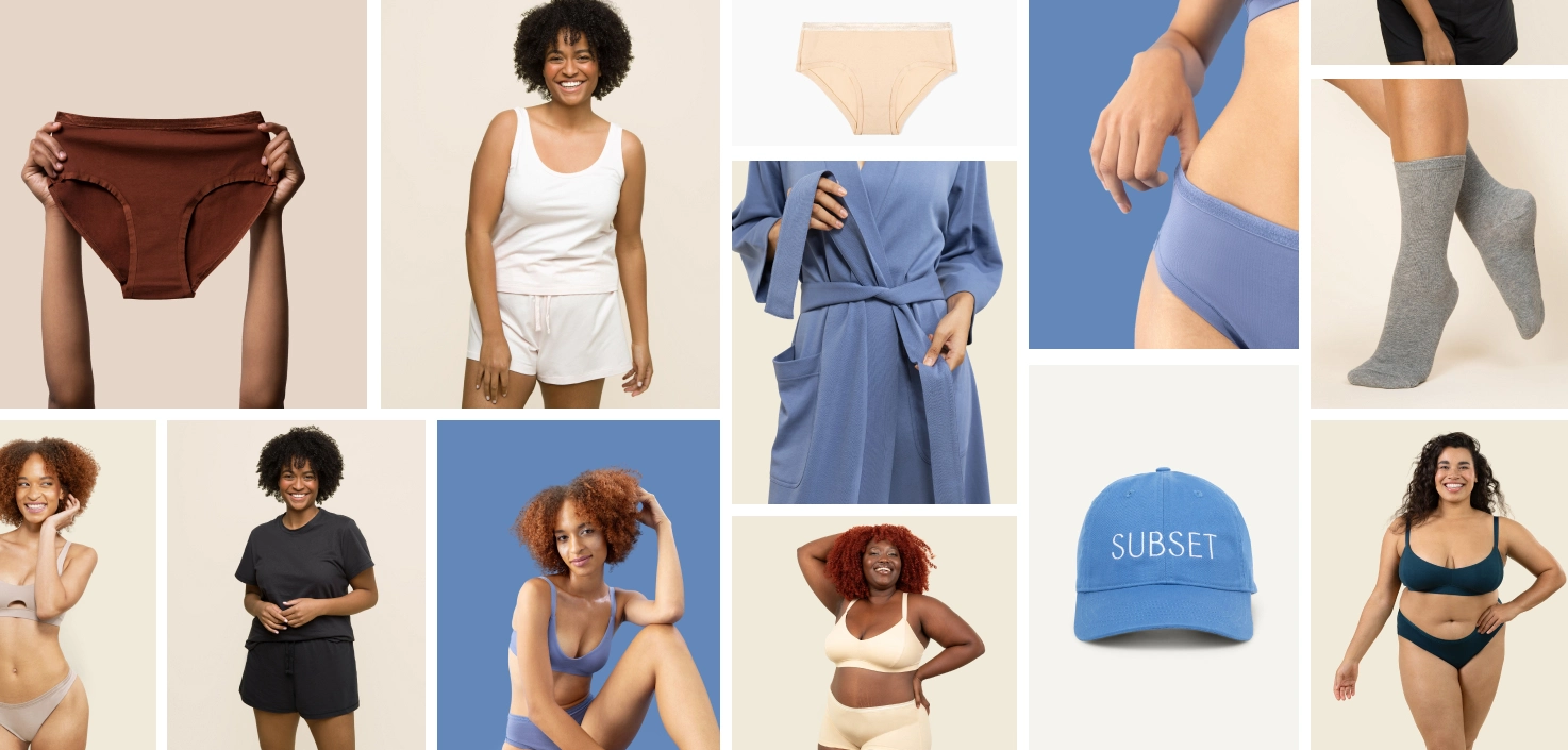
Your catalog is a visual system
Most brands know that good photography matters. What's harder to see is that the relationship between your images matters just as much as the quality of any single one.
When shoppers land on your page, their brain is scanning fast. Consistent backgrounds, lighting, crop ratios, color grading — these cues signal that a brand is organized and trustworthy. Inconsistency sends the opposite message. A mix of on-white shots, AI renders, lifestyle photos from different eras, and product shots with different lighting all on the same page creates visual noise. When shopping feels hard, people leave.
The data backs this up. According to Salsify's 2025 Consumer Research, 71% of shoppers have returned a product because it didn't match its online listing. And 54% have abandoned a purchase because product content wasn't consistent across channels. That's not a photography problem in isolation, that's a system problem.
How inconsistency creeps in
Most brands don't plan for this. It just happens. You launch with one studio. A year later you add a product line and use a different vendor because it's faster. Someone on your team experiments with AI imagery to fill gaps. A new hire has their own style preferences. Before you know it, your catalog is a patchwork.
This is one of the most common things we see at soona. It almost always comes from treating each shoot as a one-off project instead of a contribution to an ongoing visual identity. The cost doesn't always show up in an obvious way, but it shows up in conversion rates, in returns, and in that vague sense that a brand feels unpolished even when individual images are technically fine.
A note on AI imagery
AI-generated product photos have gotten genuinely impressive and they're only getting better. For color variant previews, quick mockups, and ad testing, they can add real value. But mixing AI images with professional photography on the same page, without careful art direction to bridge them, almost always creates inconsistency that shoppers notice. Lighting doesn't match. Shadows feel off. Textures read differently. It creates an uncanny valley effect across your catalog.
The same can be true for mixing studios and photographers. Every vendor has their own defaults; preferred lighting setups, retouching style, their version of a "clean white background." Without a detailed style guide enforced at every shoot, those defaults will show up in your images, and they rarely match each other.
What it actually takes to stay consistent
Visual consistency isn't a one-time project. It's something you have to build into how you operate.
The brands that get it right tend to do a few things: they document their visual standards in a style guide and share it with every vendor and every shoot. They work with a small, coordinated set of creative partners so output stays cohesive. They audit their live catalog on a regular cadence, not just new arrivals. And when they rebrand or update their logo, they treat it as a trigger to review every customer-facing touchpoint before anything goes live.
It matters
Your brand isn't just your logo or your product. It's the cumulative impression you create across every touchpoint. In ecommerce, that impression is almost entirely visual. Every mismatched image chips away at the trust that turns browsers into buyers.
Consistency won't make a bad product good. But it will make a good product look like it belongs to a brand worth trusting — and that's what shoppers are really deciding when they land on your page.
The brands getting this right aren't the ones with the biggest budgets. They're the ones who treat their visual identity like a system.
Where to start
If this is prompting you to take a closer look at your own visual system, a good first step is adding an imagery guidelines section to your existing brand guide. You don't need to document everything at once. Starting with a simple do/don't framework — even just a single page — gives your team and any vendors you work with a shared reference point. Here’s a public example of a brand imagery guide.
A strong "don'ts" list is often more useful than a long list of rules, because it's faster to align on what's off-brand than to describe exactly what's on-brand. Think about things like: do we allow heavily stylized or artificially colorized imagery? Props that don't relate to the product? Extreme angles that misrepresent scale? Cliched stock photography tropes?
Getting those answers written down, even informally, is the foundation of a consistent visual identity. From there you can build out the fuller system - backgrounds, lighting standards, crop ratios, file specs over time.
Talk with one of our creative experts about your next project. And don’t forget to add your brand guidelines to your soona profile!
Your brand is sending a message. Is it the right one?
Why visual consistency matters more than any single great photo.
Imagine walking into a high-end boutique. The lighting is warm, the displays are carefully arranged, the packaging is clean and uniform. Then tucked in the corner, there's a dusty folding table. Products piled up with no organization, damaged packaging, no presentation. Same prices as everything else in the store.
Would you trust those products the same way? Probably not.
That corner table is what your product page looks like when your photography isn't consistent.
Your catalog is a visual system
Most brands know that good photography matters. What's harder to see is that the relationship between your images matters just as much as the quality of any single one.
When shoppers land on your page, their brain is scanning fast. Consistent backgrounds, lighting, crop ratios, color grading — these cues signal that a brand is organized and trustworthy. Inconsistency sends the opposite message. A mix of on-white shots, AI renders, lifestyle photos from different eras, and product shots with different lighting all on the same page creates visual noise. When shopping feels hard, people leave.
The data backs this up. According to Salsify's 2025 Consumer Research, 71% of shoppers have returned a product because it didn't match its online listing. And 54% have abandoned a purchase because product content wasn't consistent across channels. That's not a photography problem in isolation, that's a system problem.
How inconsistency creeps in
Most brands don't plan for this. It just happens. You launch with one studio. A year later you add a product line and use a different vendor because it's faster. Someone on your team experiments with AI imagery to fill gaps. A new hire has their own style preferences. Before you know it, your catalog is a patchwork.
This is one of the most common things we see at soona. It almost always comes from treating each shoot as a one-off project instead of a contribution to an ongoing visual identity. The cost doesn't always show up in an obvious way, but it shows up in conversion rates, in returns, and in that vague sense that a brand feels unpolished even when individual images are technically fine.
A note on AI imagery
AI-generated product photos have gotten genuinely impressive and they're only getting better. For color variant previews, quick mockups, and ad testing, they can add real value. But mixing AI images with professional photography on the same page, without careful art direction to bridge them, almost always creates inconsistency that shoppers notice. Lighting doesn't match. Shadows feel off. Textures read differently. It creates an uncanny valley effect across your catalog.
The same can be true for mixing studios and photographers. Every vendor has their own defaults; preferred lighting setups, retouching style, their version of a "clean white background." Without a detailed style guide enforced at every shoot, those defaults will show up in your images, and they rarely match each other.
What it actually takes to stay consistent
Visual consistency isn't a one-time project. It's something you have to build into how you operate.
The brands that get it right tend to do a few things: they document their visual standards in a style guide and share it with every vendor and every shoot. They work with a small, coordinated set of creative partners so output stays cohesive. They audit their live catalog on a regular cadence, not just new arrivals. And when they rebrand or update their logo, they treat it as a trigger to review every customer-facing touchpoint before anything goes live.
It matters
Your brand isn't just your logo or your product. It's the cumulative impression you create across every touchpoint. In ecommerce, that impression is almost entirely visual. Every mismatched image chips away at the trust that turns browsers into buyers.
Consistency won't make a bad product good. But it will make a good product look like it belongs to a brand worth trusting — and that's what shoppers are really deciding when they land on your page.
The brands getting this right aren't the ones with the biggest budgets. They're the ones who treat their visual identity like a system.
Where to start
If this is prompting you to take a closer look at your own visual system, a good first step is adding an imagery guidelines section to your existing brand guide. You don't need to document everything at once. Starting with a simple do/don't framework — even just a single page — gives your team and any vendors you work with a shared reference point. Here’s a public example of a brand imagery guide.
A strong "don'ts" list is often more useful than a long list of rules, because it's faster to align on what's off-brand than to describe exactly what's on-brand. Think about things like: do we allow heavily stylized or artificially colorized imagery? Props that don't relate to the product? Extreme angles that misrepresent scale? Cliched stock photography tropes?
Getting those answers written down, even informally, is the foundation of a consistent visual identity. From there you can build out the fuller system - backgrounds, lighting standards, crop ratios, file specs over time.
Talk with one of our creative experts about your next project. And don’t forget to add your brand guidelines to your soona profile!